OVERVIEW
Fiona's Coffee is a coffee website offering online ordering service.
PROBLEMS
People avoid talking to each other to reduce the risk of spread of viruse although they are wearing masks during the COVID pandemic. Consumers and store employees are seeking ways to minimise the contact as possible.
SOLUTIONS
Consumers can order through their phone and laptop easily and contactlessly, then the coffee shop can start preparing the coffee after receiving the money and order. It also minimises the waiting time for the coffee on the consumer's perspective.
MY ROLES
Research, design and prototype
Deliverables
Research
Design
Prototype
Tools
AdobeXD
GitHub
Duration
2 days
RESEARCH AND DISCOVERY
- RESEARCH -
MARKET RESEARCH
We reserached how the other coffee shop features their drinks and foods on the website to get the best practice. We also got some inspirations from Dribble to understand how POS works, so that we know what information do the users need to put while ordering online.
We found that some ordering systems are lack of edit function. If the user made a wrong order, there would be no options to cancel or decrease the quantity of the drink they had selected. To improve this, we must have an option for users to edit the orders they put in the cart and make sure they have to confirm it again before the transaction.

Users can adjust the quantity or cancel all of the selected drink easily

User did not want one lavender latte coffee
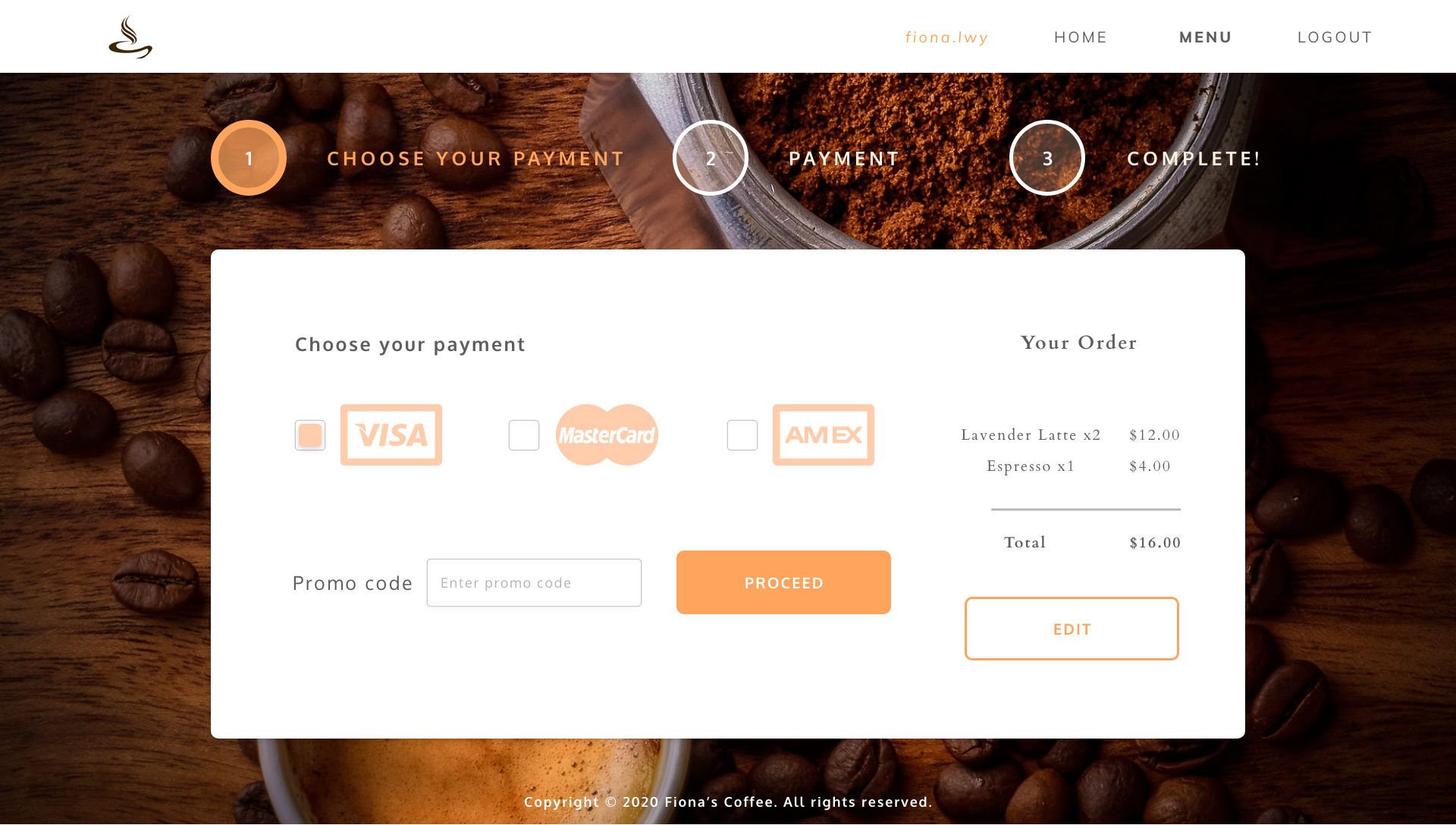
Quick edit
INFORMATION ARCHITECTURE
WHAT CUSTOMERS CONCERN
We learned that people with lactose intolerance are unable to fully digest the sugar (lactose) in milk, we need to indicate what ingredients inside the speical drinks for them to make their decisions. It does not only help this group of people, but also those who are having different diet plans.
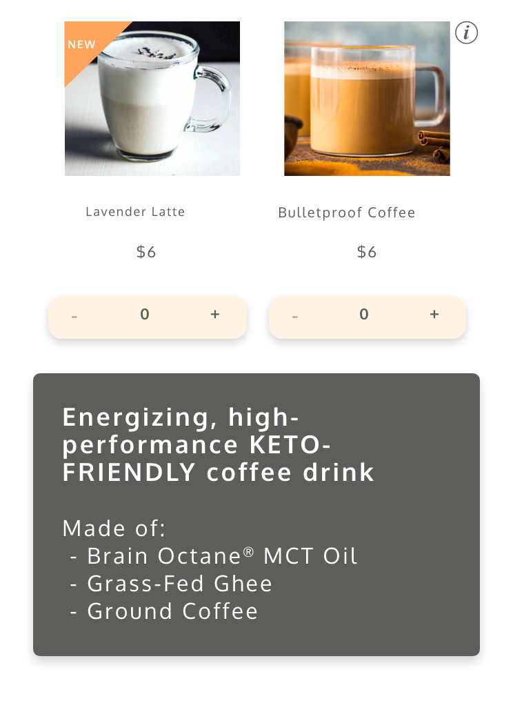
Bulletproof Coffee info
PROTOTYPE AND TESTING
- PROTOTYPE -
Prototype (Mobile) Prototype (Desktop)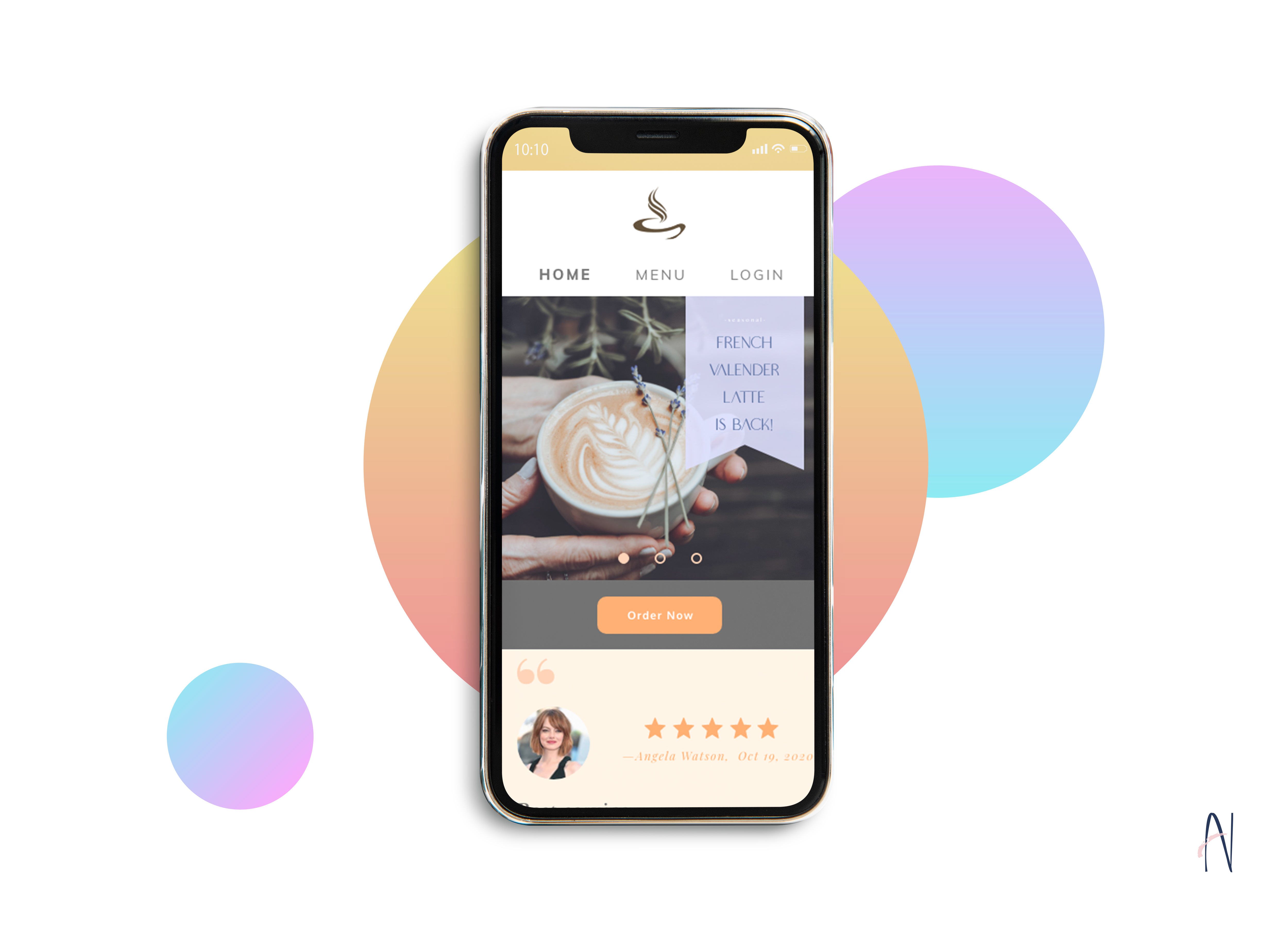
Fiona's Coffee
Homepage carousel to promote features, offers and updates
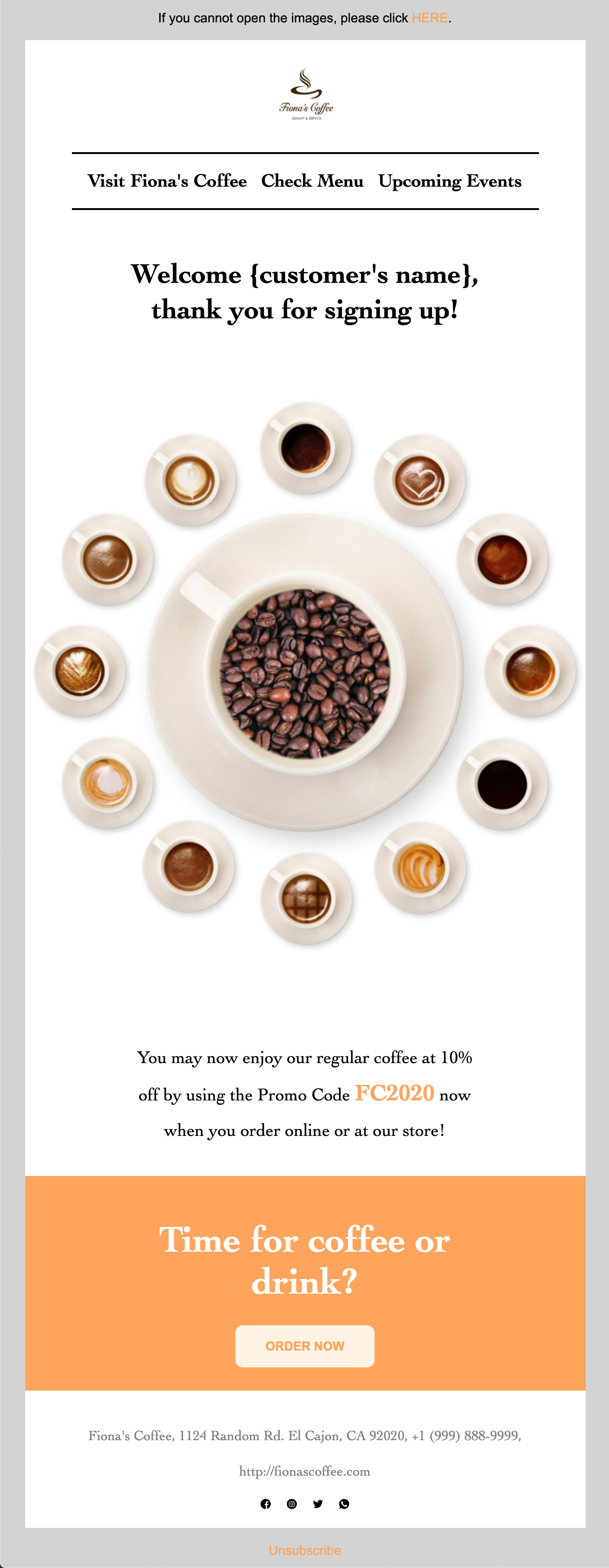
Coffee shop eDM
VISUAL DESIGN
COLOR
we used soft tone to make the users feel they are welcome. Orange color also gives people feelings of passion and energy, therefore we used some vibrant orange to locate the focal point. To match that color, we used tint orange as a background.
TYPOGRAPHY
We used Cardo for the title and Oxygen for the body. The brand are modern, simple and chill. We have considered to use script typeface but that would be hard to read, especially on mobile, therefore we chose a simpler typeface here. Also, it helped to reduce the loading time to get the uncommon typeface.
CONCLUSION
SOLUTION
Users can skip their waiting time for the coffee. If they do not feel convenient to make an order by phone, they can just take out their phones to order online and pay easily. All they need to do is to go to the store for picking up the coffee without contacting to the people.
IMPROVEMENT?
I believe developing an app may make it even more convenient, so the users do not need to sign in everytime they want to order. It can also save the billing information for the users to make the ordering process easier in the future that helps to increase the conversion rate on business side.
Prototype (Mobile) Prototype (Desktop)VIEW OTHER CASE STUDIES...

Storage Buddy
Storage Buddy is a free cloud storage and organizing app allowing users to save and access files online
VIEW CASE STUDY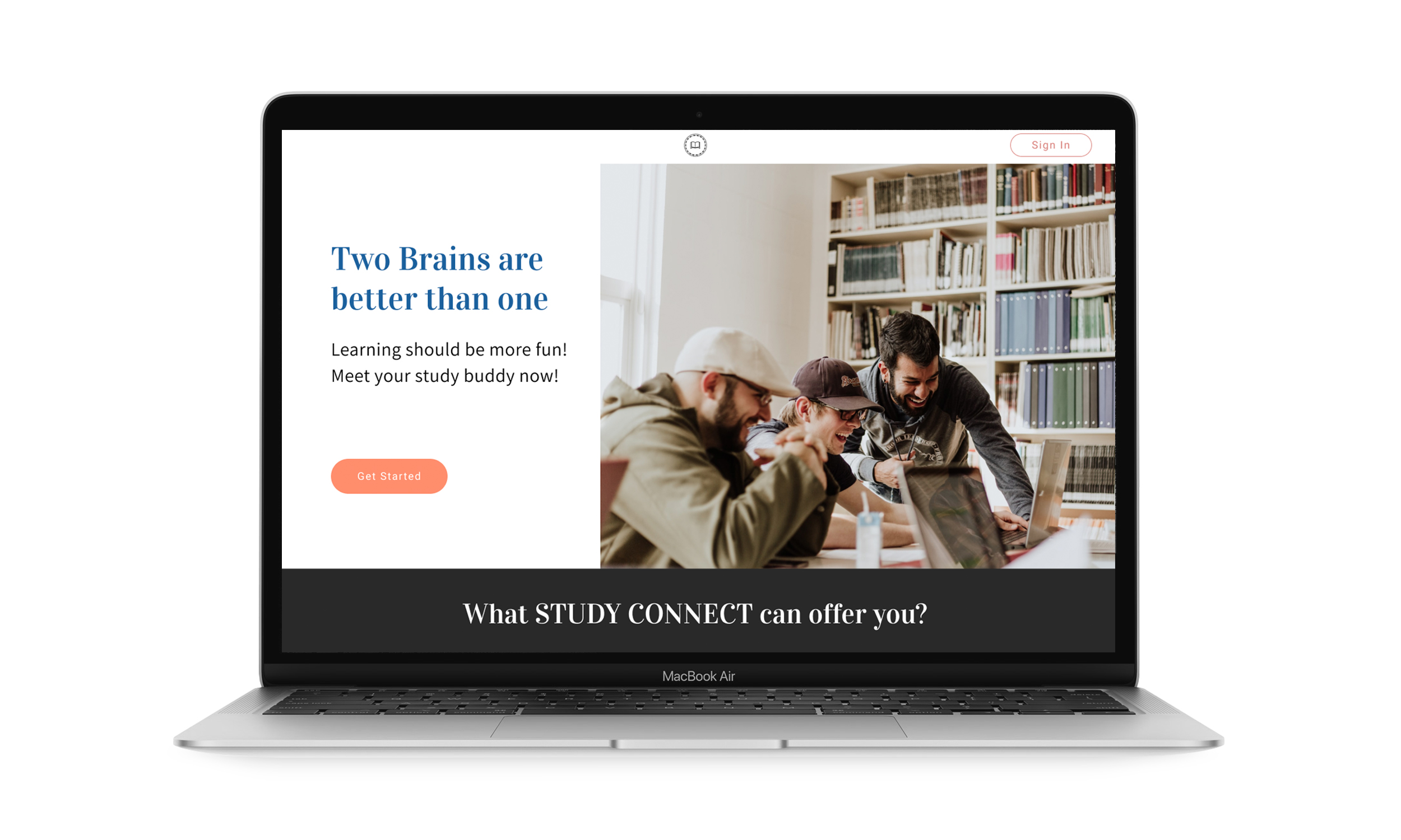
Study Connect
Study Connect is an app for study groups to plan their schdeules with peers and tutors
VIEW CASE STUDY