OVERVIEW
BusyBus is a public transit app that detects the user's location and show the bus information.
view githubPROBLEMS
Riders are currently complaining the most about the bus stop at Washington and State, which has seven bus lines serving the stop.
SOLUTIONS
Users can check what the next arriving bus is and expected arrival time, so that they do not need to rush to the bus stop.
MY ROLES
From research, design, prototype to execution.
Deliverables
Research & Survey
User Story
Wireframe
Sketch
Digital Wireframe
Prototype
Usability Test
Tools
Figma
InVision
GitHub
Atom
Duration
1 week
RESEARCH AND DISCOVERY
- RESEARCH -
I. COMPETITIVE ANALYSIS
We conducted SWOT analyses for Google Map and Moovit Apps.
/cdn.vox-cdn.com/uploads/chorus_asset/file/19700731/googlemaps.png)
Icons of Google Map and Moovit
New competitors could enter this marketplace by doing the points below.
-Providing more exploration for the users maybe hotel or shopping mall that is doing sales.
-Local users can also provide upcoming events with the nearest stop for the tourist.
-If there is a shortcut that local users know, they can also share that in the app so that the
tourist can avoid the crowd or traffic.
II. USER SURVEY
VIEW SURVEYIn general, participants think that overcrowding (65%) and bad schedule (45%) are the frustrations that they have when they take a public transportation.
Habit
55% of the participants do not usually take bus as transportation because the buses do not come on time (55%) and taking bus is not convenient for them (46%). Instead, they take subway, railway train or drive their cars, contributing 27.3% for each.
45% of the participants usually take bus as transportation for work (77.8%). The main reasons are convenience (66.7%), cost (44.4%) and taking bus is the quickest way to arrive the destination (44.4%). They think convenience (44.4%) is the most important thing for taking bus, followed by stability / reliability (33.3%).
Public Transit App non-users VS users
15% of the participants have not used public transit app. 66.7% of them do not arrive earlier at the stop although 66.7% of them think the transportation they use is not always on time. If there is a chance they can try a public transit app, only 33.3% would try it. The rest think they do not need it. Therefore, I think these participants are very familiar with the schedule by transportation experience.
85% of the participants have used public transit app in which 82.4% of them use Google Map, because they want to manage their time better. Planning all the possible routes with details is what they appreciate the most (52.9%), followed by the estimated arrival time (29.4%).
Participants’ basic information
-55% are male
-21-40 years old
-85% student and office worker
-55% Asia, 35% North America
INFORMATION ARCHITECTURE
- USER STORIES -
Prioritizing the tasks with the importances for returning users can help us to define the project scope easily.
HIGH IMPORTANCE
-I want to know where the bus stop nearby is
-I want to know when the bus arrives the bus stop and
estimated arrival time of the destination
-I want to know if there is other alternative / bus I can take
-I want to know which bus provides
me the quickest way to the destination
MEDIUM IMPORTANCE
-I want to know the fare
-Offline maps to search and navigate without an internet
connection
-Options for taking drive, public transportation or walk
-A get-off alert to remind
me to get off
-Street View and indoor imagery
-Save my home and work locations
LOW IMPORTANCE
-I want to know more about the local restaurant, event and activities around
Show the closest bike
share / gas station
-Create lists of my favourite places and share it to friends
PROTOTYPE AND TESTING
- PROTOTYPE -

Paper prototype
- USABILITY TEST -
We covered two areas for the mobile app BusyBus:
-Find the next arriving bus
-How much time left before its departure
Background of the participants
They are all Hong Kongers who have been to US, mainly California, to study for many years. All of them have the experience of using public transit app like Google Map. Usually they use it to guide themselves to a destination only, so they do not have to worry about the transportation. However, two of them think that GPS location accuracy is really an issue.
In general, they were able to understand and complete the tasks, but there is an opinion for the 2nd screen of the prototype.
1st screen:
The potential users were able to press “MORE” to find more about the bus available.
2nd screen:
The potential users successfully picked the next arriving bus. One of them mentioned that the
rest
of the bus were not necessary to look at if they only wanted to know which the next bus was, but
that was good to have.
3rd screen:
The potential users went to this page to see the navigation to the bus stop and they think it is
simple and easy to understand.
VISUAL DESIGN

COLOR
we used green color theme to represent speed.
At the beginning of the screen, we put the result of search “Washington and State” in the middle as an opening of the map.
For the back button, we added shadows to indicate that is clickable.
For the bus stop, we wanted to use a sharp red (contrast of green) to indicate which bus stop the user is referring to with the current location icon, so that it helps to guide the user to the bus stop.
To keep it clean and clear to read, we used black and white for the destinations and time left of the bus arrival while using green tone for the bus number in order to look consistent as a whole.
VIEW HIFI mock upFinal Prototype

There are a lot of challenges we faced during the working process of this app, especially when we worked on the responsive version for tablet.
In the original design, we added shadow for the map. When we downloaded the image file and put it to the style css, we found that the shadow displayed on the browser is not looking good as expected because the vertical shadow on the right takes up some space of the map, therefore we replaced it with another file which is without shadow. Then, we used box-shadow to adjust the look of shadow that we wanted for the ‘map’ class.
The interesting part of the css part is to divide the width for bus number, destination, time and arrow on each row. we want it more spacing between each element, but then the arrows would go to the next row, so we played with the width percentages of the elements for a while and got the sweet spot to balance all the elements while emphasizing the most important information.
To emphasize the arrival time, which is the most concern for user, we used dark green color to draw user’s attention.
To present the text hierarchy, we used light grey for the bus frequency which is the least important information for the user. For the destination, weused regular font size.
VIEW githubCONCLUSION
SOLUTION
Users can be able to look for the closest bus stop and check the estimated arrival time of the buses. They can make use of their time to plan another route or whether they should rush.
IMPROVEMENT?
It would be better if it could record the user search history, so the users can go back and forth to check different destinations quickly.
VIEW githubVIEW OTHER CASE STUDIES...

Storage Buddy
Storage Buddy is a free cloud storage and organizing app allowing users to save and access files online
VIEW CASE STUDY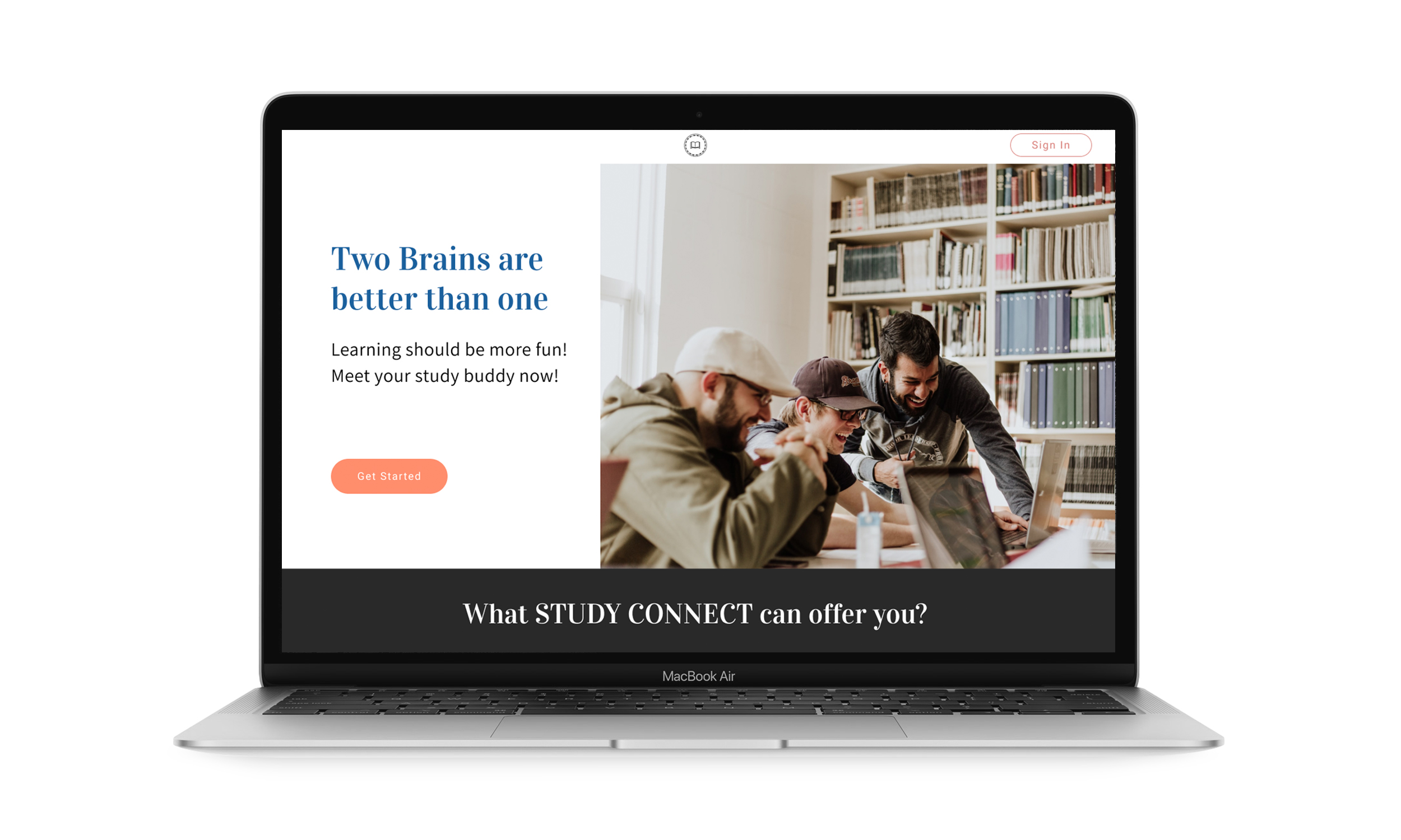
Study Connect
Study Connect is an app for study groups to plan their schdeules with peers and tutors
VIEW CASE STUDY