OVERVIEW
STUDY CONNECT provides a platform for people, especially for the self-learning students, to meet new study peers, check their schedules and schedule a meeting with them to learn better and more efficiently.
VIEW PROTOTYPEPROBLEMS
For some people, they believe that studying with other people can make learning more effective and fun. However, it is hard to find a friend to study with or they have a hard time to schedule with them.
SOLUTIONS
Study Connect allows us to connect the people who are studying in the same subject in the same area, so that we can meet new study company easier.
MY ROLES
From research, design, branding, prototype to testing.
Deliverables
Research & Survey
Persona
User Story
User
Flow
Site
Map
Content
Strategy
Wireframe Sketch
Digital Wireframe
Style
Guide
Branding
Logo
Design
Prototype
Usability Test
Tools
Figma
InVision
Maze
GitHub
Visual Studio
Code
Google
Forms
Draw.io
Duration
2 weeks
RESEARCH AND DISCOVERY
- RESEARCH -
I. COMPETITIVE ANALYSIS
There are many approaches to help the students to learn better. Study Blue provides a tool for user to create and share flash cards to memorize the terms. It has an alarm reminder to bring the user back to take a certain flashcard test. However, the shared resources are limited - only those from the hot subjects in the university.
Study Buddy is like an online classroom. It focuses on the questions the students have. Provided by the interactive whiteboard, students can have a meeting with the tutors, but there are no resources to share. Also, the subjects are limited to science and math only.
Think Binder provides a platform combining the functions of resource sharing and video chat room. Yet, the social-like feed dashboard may make it become a social platform instead of learning platform. Also, the video chat may involve porn.


Icons of Study Blue, Study Buddy and Think Binder
New competitors could enter this marketplace by doing the points below.
-Define the goal of the app - resource sharing, discussion or scheduling for a meeting
-Able to know the user’s credibility is important for the users when they want to meet a
stranger
-Share resources
-If it has a resources library, make sure it has a broad coverage of different subjects
-Users should be able to pick up a meeting time that is available for all parties
-Users should be able to check the meeting request status anytime
-Avoid making the app become a messaging or dating app
II. USER SURVEY
82% of the participants study alone
27.8% of them reflected that they could not find anyone to study with.
18% of the participants study with their friends
All of them choose to study with friends because it motivates each other and allows the exchange of resources and learning materials. 75% of them thought that friends may help when they have questions and they can have a deep discussion and explore more on some topics.
However, they are frustrated when it comes to schedule a meeting with friends. For instance, no response from friends, difficult to come up a date with busy people and no meeting reminder. All of them hope that a study group app could solve these problems.
Concerns about the study group app
Participants do not mind to study with strangers, but they have some concerns on the quality of peers whether they are at the same level and 25% of the survey participants mind if the peers are not studying in the same subject.
54.5% of them worried if the app becomes a dating app. 36.4% of them worried about getting ditched and 31.8% of them would like to know the stranger better because it is risky and dangerous.
Assumptions
Some assumptions have been made on the study place. After reviewing the survey result, we learn that the potential users usually go to other places to study instead of cafe. That changed the features that I planned to have, so we would leave the meeting venue open for users to fill in, instead of filtering the coffee shops location on a Google map. We learn to not make any assumptions at the early stage of research.
VIEW SURVEY DATAIII. PERSONA
Kyle Ferguson
23y.o./Enrolled Nurse/Techical

Motivation
-Motivating each other
-Helping to solve problem
-Learning more by being
challenged
Frustrations
-Cannot find new study peers who have the same interest
-Distracting me from
study when studying with close friends
-Getting ditched and no response upon
invitation
Goals
-To discuss some certain topics with peers
-Constantly improving himself and
the study
-Looking for a committed study buddy
"Create a synergy among peers"
Sarah Gardener
38y.o./Professor/Non-techical

Motivation
-Sharing effective learning methods and resources
-Learning and
understanding where the students get stuck
-Ensuring that her students get a good
result
-Peer to peer learning is more effective
Frustrations
-Not effective to answer the students’ questions if they come one by one
-No
place to share resources to a certain group of student
Goals
-Sharing learning materials to students
-Helping and guiding the students
when needed
-Encouraging the students to discuss and explore more
-Improving her
teaching
syllabus
"To provide the best education possible"
Tom Wick
20y.o./Postgraduate Student/Technical

Motivation
-Being as efficient as possible
-Motivating each other
-Needing a lot of
resources to support his study and research
Frustrations
-The peers cannot help with his questions
-Hard to schedule with the ones he
wants to study with
Goals
-Exchanging of useful resources
-Meeting someone he thinks who is at the
same level to study with
-Discussing on certain topics deeply
-Schdeuling a time
with
his
friends
"Meet some quality peers"
INFORMATION ARCHITECTURE
- USER STORIES -
Prioritizing the tasks with the importances for returning users can help us to define the project scope easily.
HIGH IMPORTANCE
-Register as a tutor/student
-Set the time that the user is available for study or answer the
questions
-Browse people's profile
-Meet people who is studying the same subject as mine and
living in the same area
-Update the user profile
-Access the saved files of other people
MEDIUM IMPORTANCE
-Download the files from other people's space
-Know if our expectations of studying together match
together
-Organize my files in my account
-Select a time slot to study with friends
-Check
my
schedule
-Know people's credibility
LOW IMPORTANCE
-Search related questions using the hashtag
-Know the learning style of the person before I meet
them
-Know if the person already read my message
- USER FLOWS -
As there are many features that can be added to the app, for instance, file upload, storage management, chat room and so on. It could turn out to be a messenger or cloud storage app. The scope would be too big and that would lose focus.
This app aims for connecting people and helping the user to find a suitable study company. Therefore, the user profile and shared files should reflect the knowledge they have. Next step, we tried to simplify them in the user flow.

One example of the user flows
VIEW USER FLOWS- SITE MAP -
By building a site map, it allowed us to understand the linkage between pages and build a structure of the website. It also prevents from missing work.
VIEW SITE MAP- DIGITAL WIREFRAMES -
View sketches View wireframesVISUAL DESIGN
- STYLE GUIDE -
DOWNLOAD
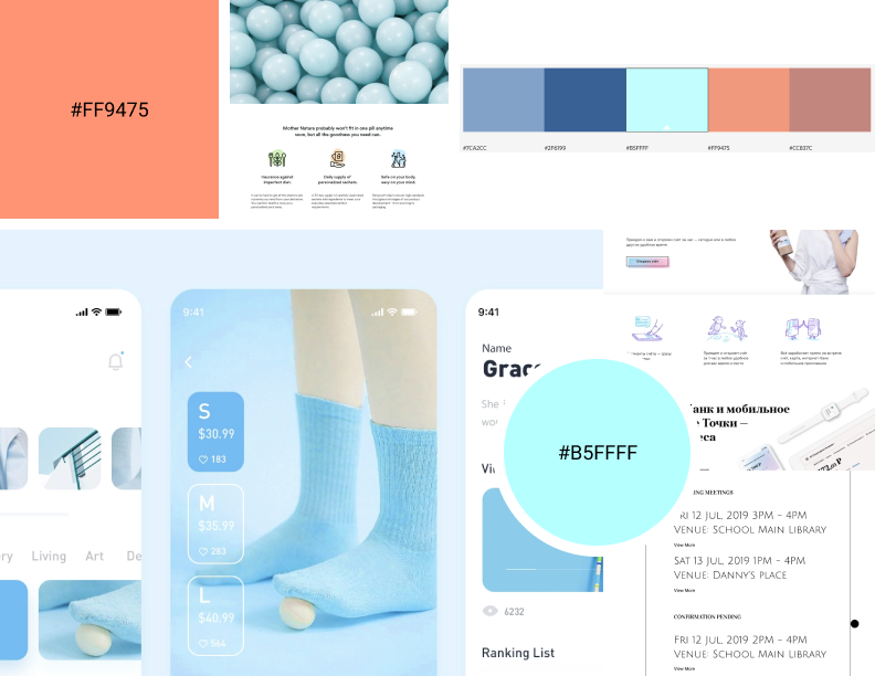
I. COLOR
We decided to use soft tone of blue to deliver a casual feeling. In order to give it more energy, we also chose orange which is a warm color as a secondary color.

Color section of Style Guide
Using monochromatic would be too boring and the contrast of orange and blue would be too sharp, so I reduced the hue of them to bring a softer look.
II. TYPOGRAPHY
For the typography, we chose Vidaloka for the headings because it has academic and grand feelings. For the body, we used Assistant as it has enough spacing between each character that is able to display the most important information like the scheduled date and time clearly.
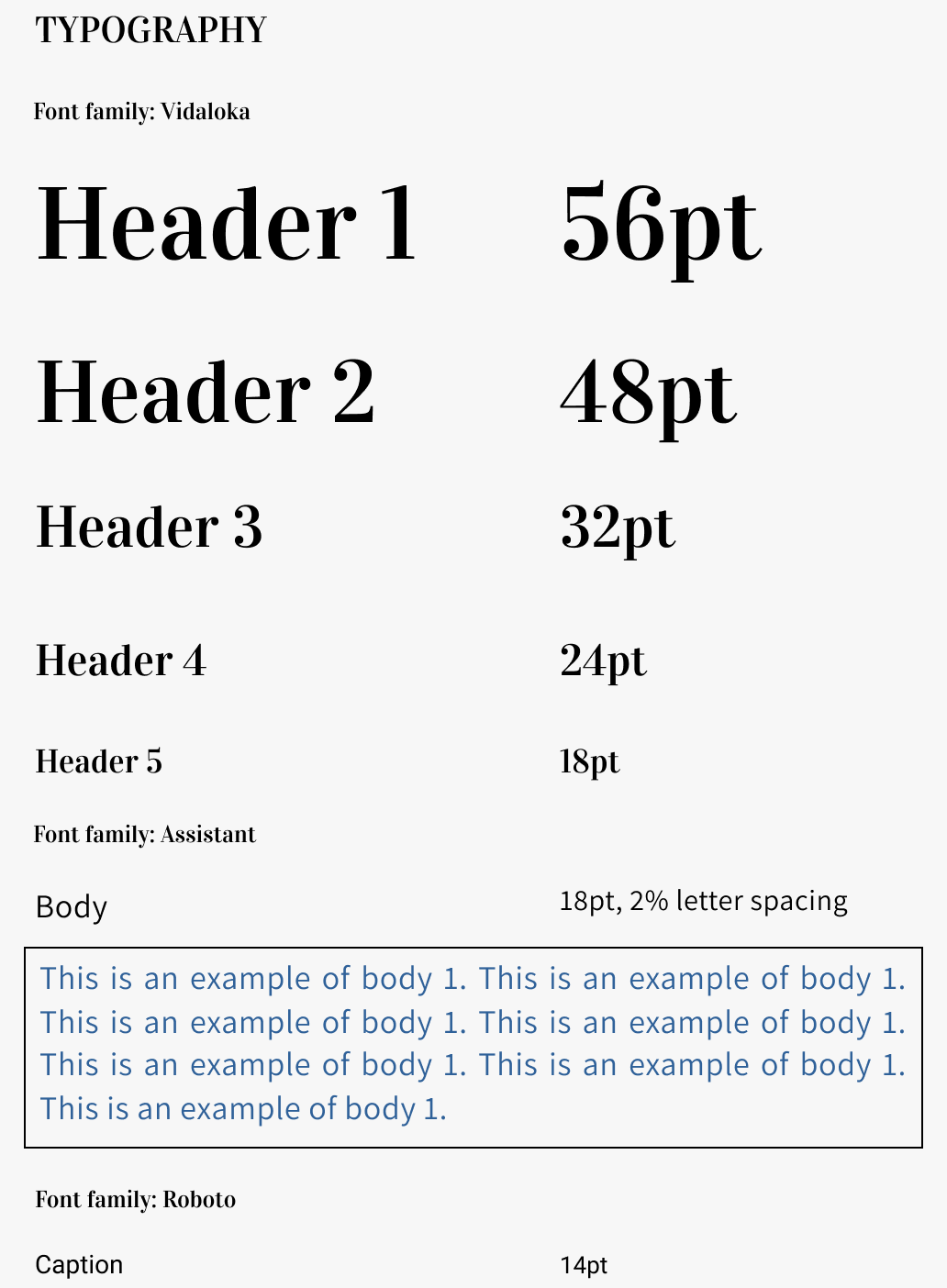
Typography section of Style Guide
- BRANDING -
BRAND CHARACTERISTICS
-Young
-Fun
-Casual
-Modern
Moodboard
- LOGO DESIGN -
Below are the sketches for the logo design.

Logo Sketches
Option 3 looks too commercial. Option 2 and 4 were the potential logos. We chose to refine option 2 because a square logo is more readable and clearer when it zooms out.
To present an academic feeling, we added a simple badge around the book.
Final Digital Logo
PROTOTYPE AND TESTING
- PROTOTYPE -
VIEW PROTOTYPEDuring this process, there are many challenges encountered and lots of iterations involved. Here below we show three of them.
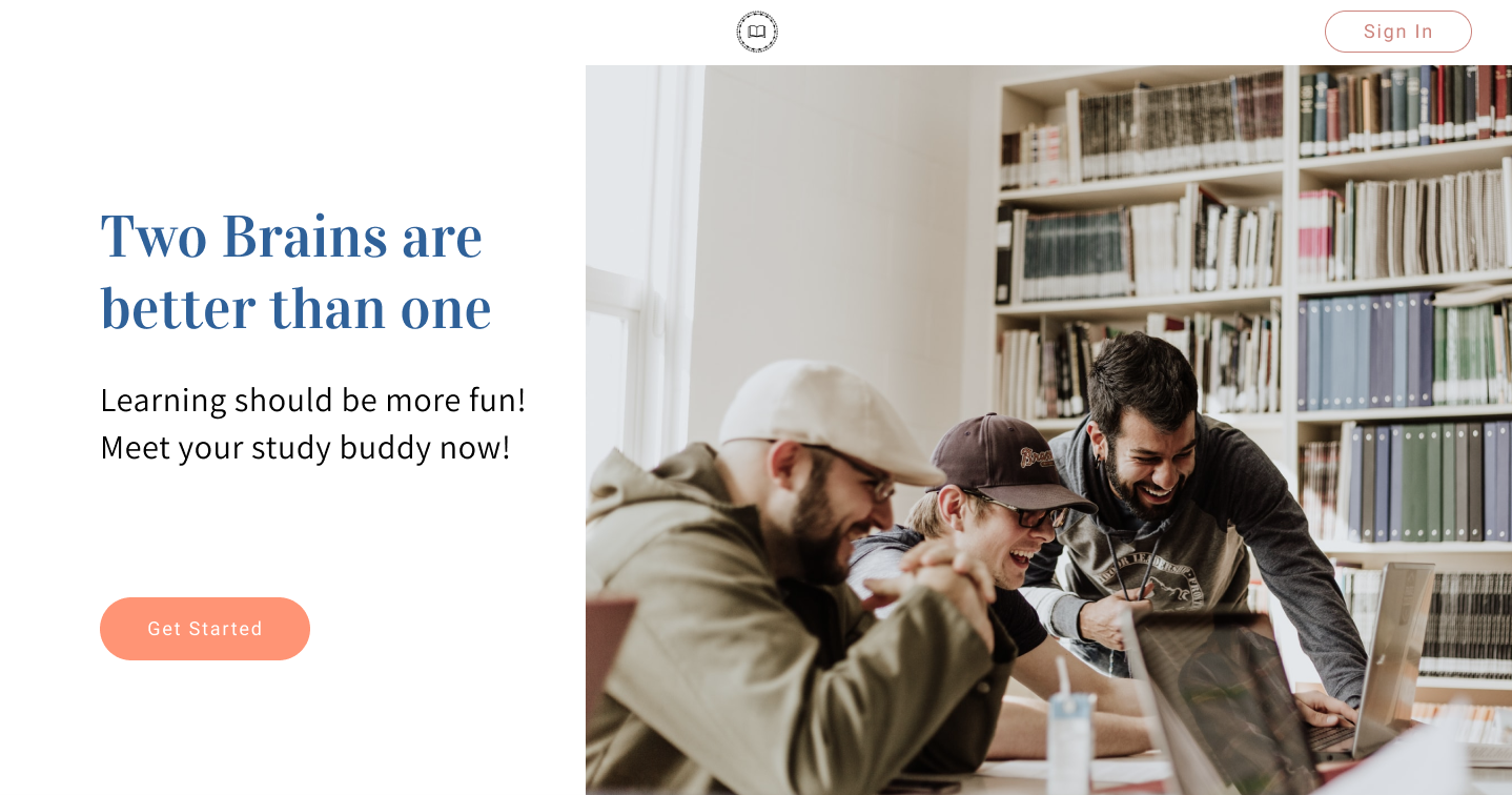
I. BUTTON STYLE
We tried to use square for the CTA buttons and sign up. However, it looks a bit too serious. To deliver a casual brand image, we changed them to rounded buttons.

The mock up of landing page
The wireframe of landing page
II. THE CURRENT LOCATION
In order to help the users to know which page they are on, we highlighted the current menu item which looks different from the rest of the menu.

No highlight on the nagivation bar
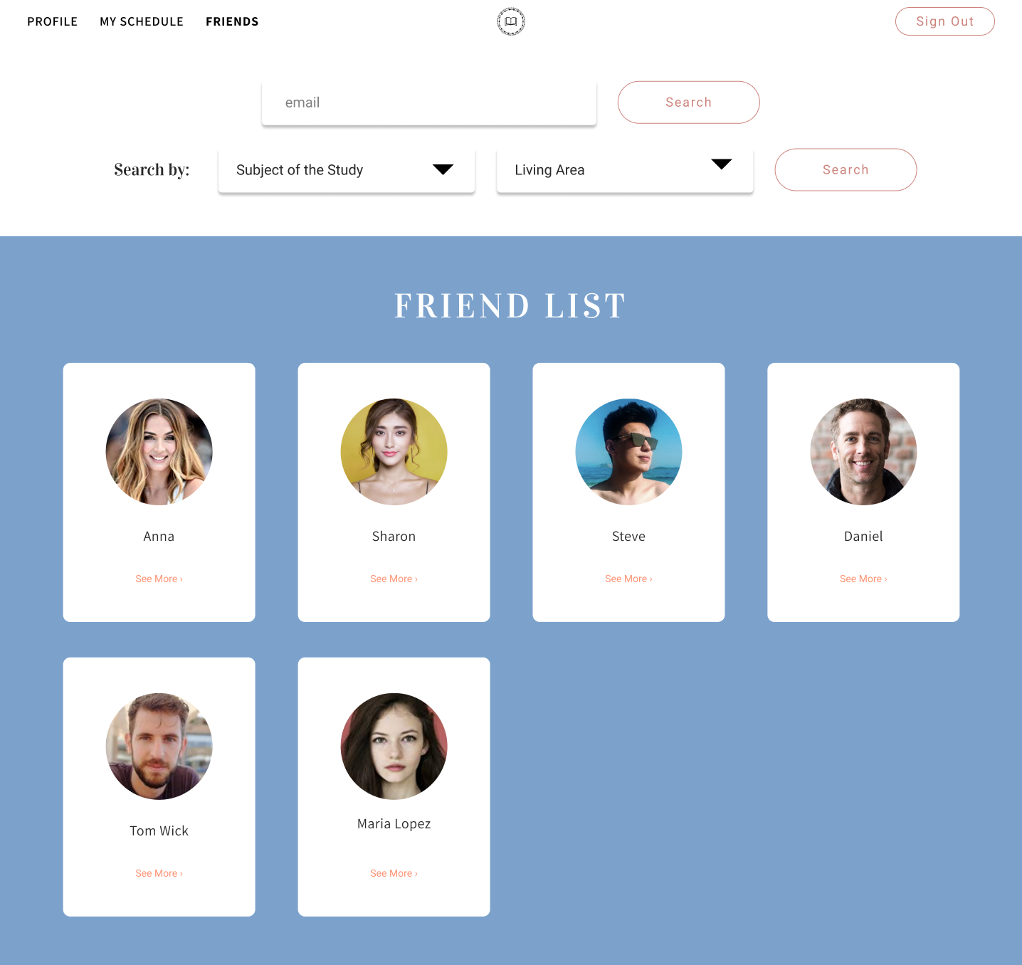
Bolded menu item for the current page
III. ADDING A HOME LINK
Users will land to the homepage after they sign in or sign up an account. However, there is no link to go back to the homepage when the user nagivates to other pages. To solve this, we added a "HOME" link on the nagviation bar to bring the users back to the homepage to have an overview of the confirmed and pending meetings, and friend's shared resources.

Homepage
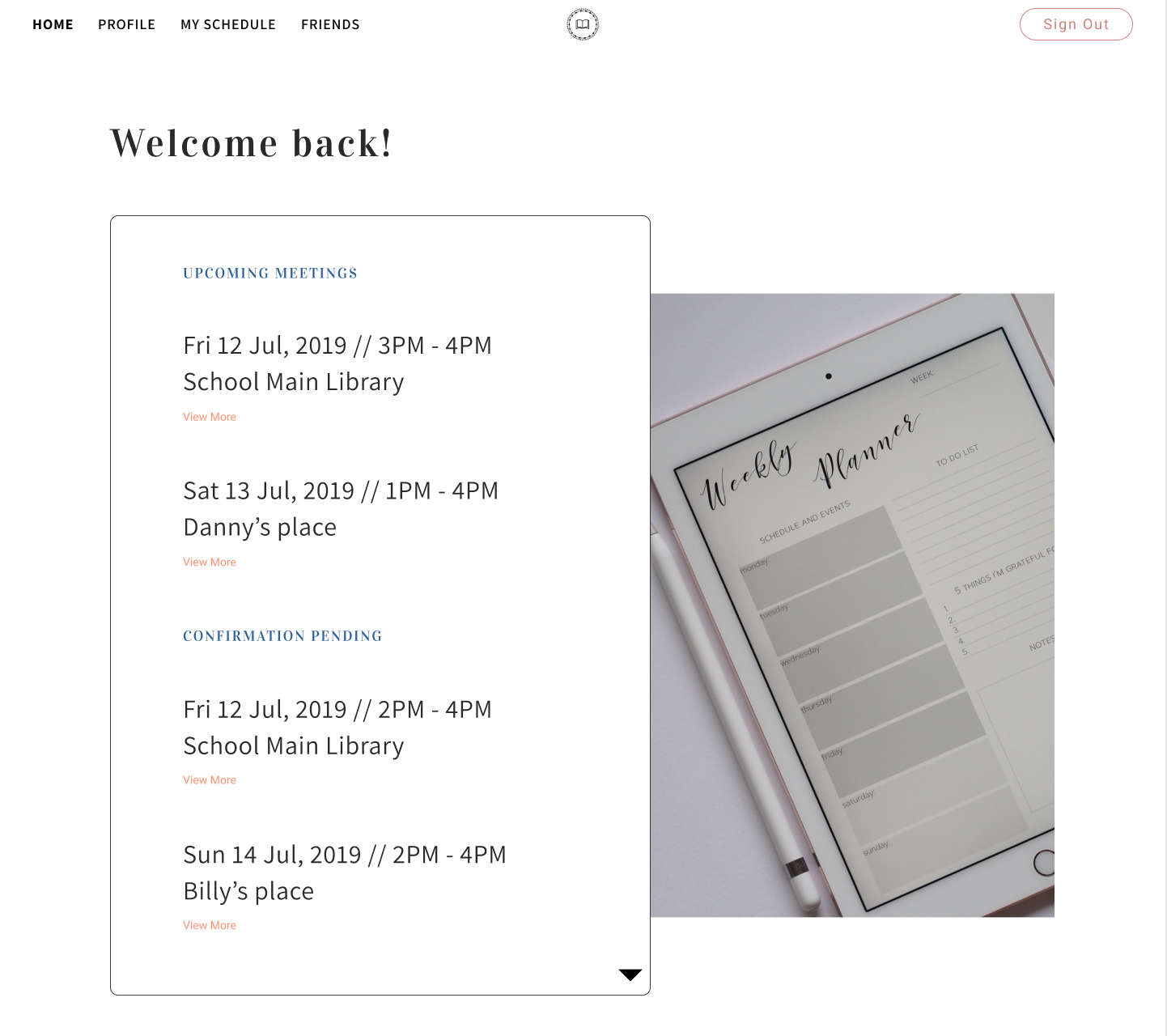
HOME link is added on the nav bar
- USABILITY TEST -
In the usability test, we tested the processes of sign-up, checking a friend's schedule and requesting for a meeting.
The result has a very high success rate. The testers understood the flow and completed the tests without any difficulty. The only opinion is that the logo or homepage link should usually be placed on top left corner while the rest of the menu item should be placed on the right.
It is seen as one's preference. We do not see a big issue there because there are websites putting logo at the center and the menu items on the sides.
CONCLUSION
SOLUTION
Users can now search new study peers. By checking the profile, users can have a better expectation and download the learning materials.
Also, provided with friend's schedule, user can quickly come out a date, request a meeting with them and check who is/are going.
IMPROVEMENT?
To highlight the dates that already have meetings on top of the calendar image, I had to bold the numbers in order to cover the meeting dates on the image. If I have more time, I would create the calendar myself to make sure it covers the date properly.
Also, I would think more about the scheduling flow with a person. Can the user select a date that the person is not available? Maybe that person would like to rearrange the schedule for the user? To keep things simple, we decided to let the user only select the date that the person is available. For now, the only solution is, if the user really wanted to meet the person, he or she could select a date that matches to the person’s schedule and leave a note, requesting for an arrangement.
VIEW PROTOTYPEVIEW OTHER CASE STUDIES...

Storage Buddy
Storage Buddy is a free cloud storage and organizing app allowing users to save and access files online
VIEW CASE STUDY
BusyBus
BusyBus is a public transit app, showing the next arriving bus to solve the problem of too many bus lines serving the same stop
VIEW CASE STUDY