OVERVIEW
Storage Buddy is a cloud storage and organizing app, allowing users to efficiently upload, retrieve, organize and share the files on mobile, laptop and tablet, anywhere.
VIEW PROTOTYPE (DESKTOP) VIEW PROTOTYPE (MOBILE)PROBLEMS
Overwhelming action buttons. Bad organizing experience.
SOLUTIONS
Minimize the options in every event. Improve the overall organizing efficiency.
MY ROLES
From research, design, branding, prototype to testing.
Deliverables
Research & Survey
Persona
User Story
User
Flow
Site
Map
Content
Strategy
Wireframe Sketch
Digital Wireframe
Style
Guide
Branding
Logo
Design
Prototype
Usability Test
Preference Test
Tools
Figma
InVision
GitHub
GitHub Atom
Visual Studio
Code
Usability
Hub
Google
Forms
Draw.io
Duration
6 weeks
RESEARCH AND DISCOVERY
- RESEARCH -
I. COMPETITIVE ANALYSIS
By conducting SWOT analyses for WeHeartIt, Pinterest and Reddit, we made an assumption that sharing contents without restrictions could lead to many issues, such as spam and quality control. Yet, the advantage is that it provides an open door for the company to reach more potential customers who show particular interests that match them.
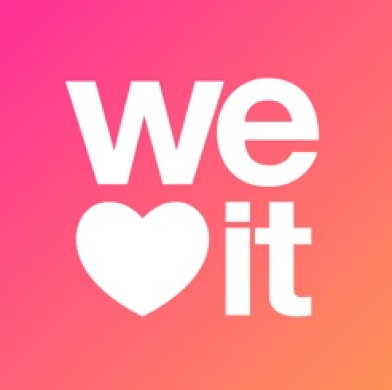


Icons of WeHeartIt, Pinterest and Reddit
VIEW COMPETITIVE ANALYSISII. USER SURVEY
The questions to potentially provide the strongest data are “Why do people use cloud storage and organizing app” and “What is/are the frustration(s)?” because it helped to dictate a general direction. From the survey, we know that people using cloud storage and organizing app for 3 main reasons. The top reasons are:
“It’s common and convenient to work with the others”, “accessibility that you can get the files more than one place” and "To save space on my mobile/computer".
Next step, to ensure the workflow effectiveness of sharing-related features (download and share link) became the first direction that guided me during the project. Additionally, ALL of the participants are using mobile to connect to cloud storage service, while 94.1% of them are using both computer and mobile to enjoy the cloud service. Therefore, besides doing a desktop version for the app, it is necessary to build a mobile version too.
Another reason to use a cloud storage app is “to save space on my mobile/computer”.
It could be seen as another group of potential audience who uses the cloud storage app for personal use besides collaborating with people.
At last, “Bad organizing experience” comes to the most frustrating part from the users. It affects both groups of people who use the cloud storage app for their own uses and those who use it for collaboration. So, the organizing flow should be worth putting the most effort.
VIEW SURVEY DATAIII. PERSONA
Amy
30y.o./Food blogger/Enthusiast

Motivation
Amy loves to interact with her friends and followers. Whatever she takes (interesting videos/photos), she organizes them in categories and select some for her colleagues to publish them in social media.
Frustrations
-No offline access
-Not able to share on social media directly
Goals
-Mobile friendliness
-Back-up the files for safety reason
"I rely on the sharing tool to collaborate with people."
Susan
26y.o./Digital Designer/Enthusiast

Motivation
Susan saves a great deal of inspiration img, videos and links on Pinterest, Google Drive, etc. at work and study. She appreciates the organizing ways they provide, eg. select and move many files to another category.
Frustrations
-Storage Limit
-Bad organizing experience
Goals
-Save space on mobile or computer
-Access the files more than one place
"I'd prefer to keep files in the cloud in case I want to get it back."
Daniel
31y.o./Video Editor/Professional

Motivation
Daniel spends most of his time on Google Drive for work. He always needs to send video and PDF files to colleagues and clients. Attaching large files consume a lot of time to load and sometimes they are too large that exceed the email capacity size limit. If comment feature was available, it would make him easier to follow-up the task by keeping everything at the same place.
Frustrations
-Comment is not allowed
Goals
-Send a whole folder to people efficiently
-Access the files through mobile
and computer
"All the colleagues are used to share link rather than attaching files. It saves a lot of time."
INFORMATION ARCHITECTURE
- USER STORIES -
Prioritizing the tasks with the importances for returning users can help us to define the project scope easily.
HIGH IMPORTANCE
-Upload files
-Download files
-Share files
-Save
files in my
space
-Access the saved files in my account
MEDIUM IMPORTANCE
-Organize my files in groups
-Set the files to public,
private or specific
people only
-Share the file or folder to a large group of people
-Share a whole folder
to
people
-Real-time collaboration in notes or document
-Share it on social
media
-Select
more
than one file during organizing my files
LOW IMPORTANCE
-Create comment with history on the file
-Set authority for
users or
recipients
-Create documents, spreadsheets and notes.
-Access file offline
-Upgrade
the
storage
capacity size
-Timestamp record when the recipient opens the file
-Edit my profile
setting
- USER FLOWS -
Users always want to have many features as possible. According to the priority, similar tasks were grouped together and the working processes were simplified in order to avoid overwhelming options as mentioned in the GOAL.
By understanding and comparing the user flows of Reddit, Pinterest and WeHeartIt, here is the user flow for Storage Buddy after examining the user stories and survey result.
VIEW USER FLOWS (DRAFT)In the beginning, everything was linked together but that was hard to evaluate the process of EACH user flow in detail. Therefore, they were listed out separately in a digital form with the descriptions of user stories, and that contributes to the minimum viable product (MVP).
One example of the user flows
VIEW USER FLOWS (DIGITAL)- SITE MAP -
By building a site map, it allowed us to understand the linkage between pages and build a structure of the website. It also prevents from missing work.
VIEW SITE MAP- WIREFRAME SKETCHES -
Scroll right for more...

Sketches for the landing page and sign in page

Sketches for the homepage and the screen of adding files

Sketches for the screens of sharing and moving a file

Sketches for the screen of downloading a file

Sketches for the Account Upgrade page
- DIGITAL WIREFRAMES -
Scroll right for more...

Wireframe of the landing page
Wireframe of the sign in page
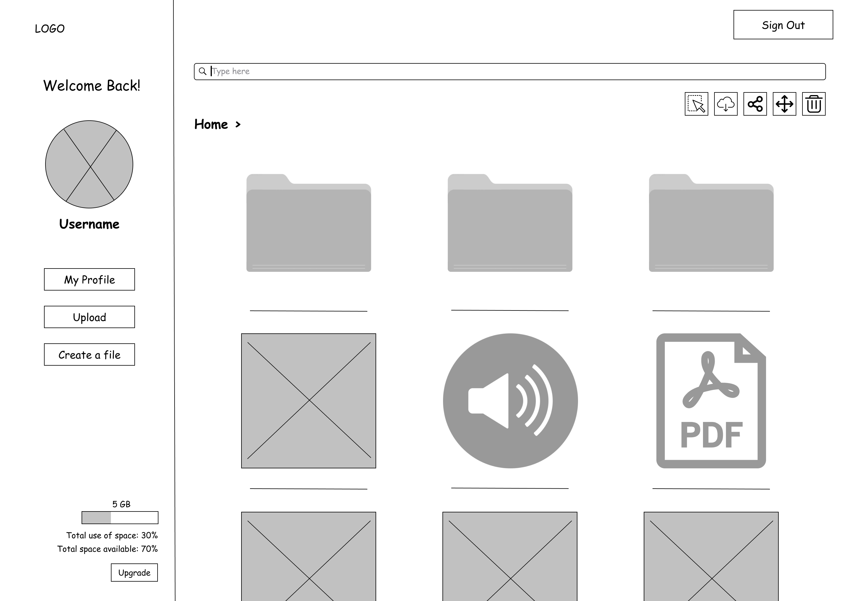
Wireframe of the dashboard

Wireframe of adding a file
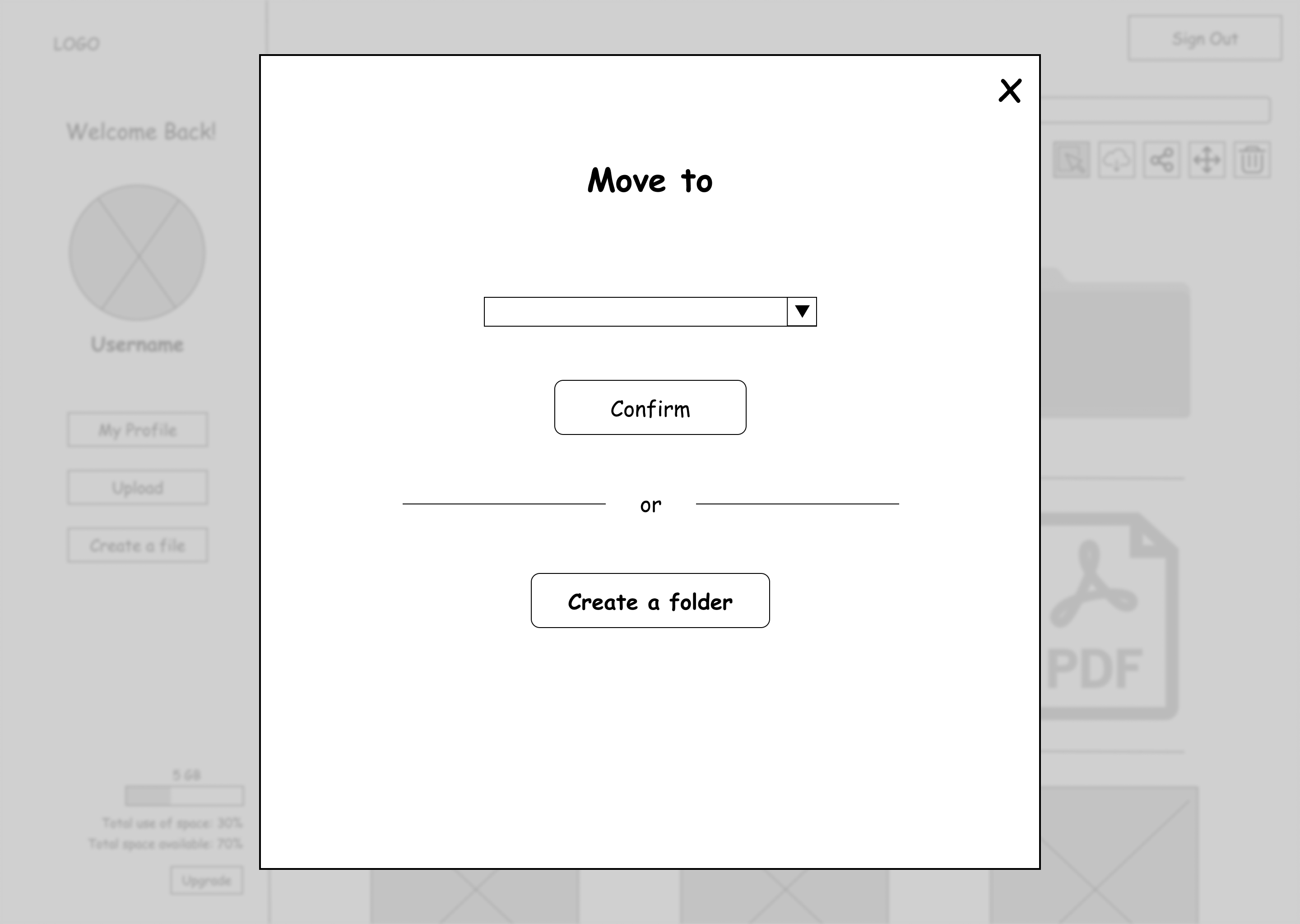
Wireframe of moving a file

Wireframe of Account Upgrade page
VISUAL DESIGN
- STYLE GUIDE -
DOWNLOAD
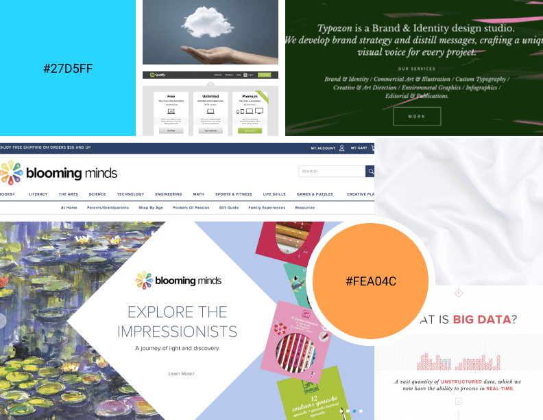
I. COLOR
It is common to use blue to represent profession and security, but the brand is going to be more casual, so a softer color with lower chroma was chosen as the primary color.
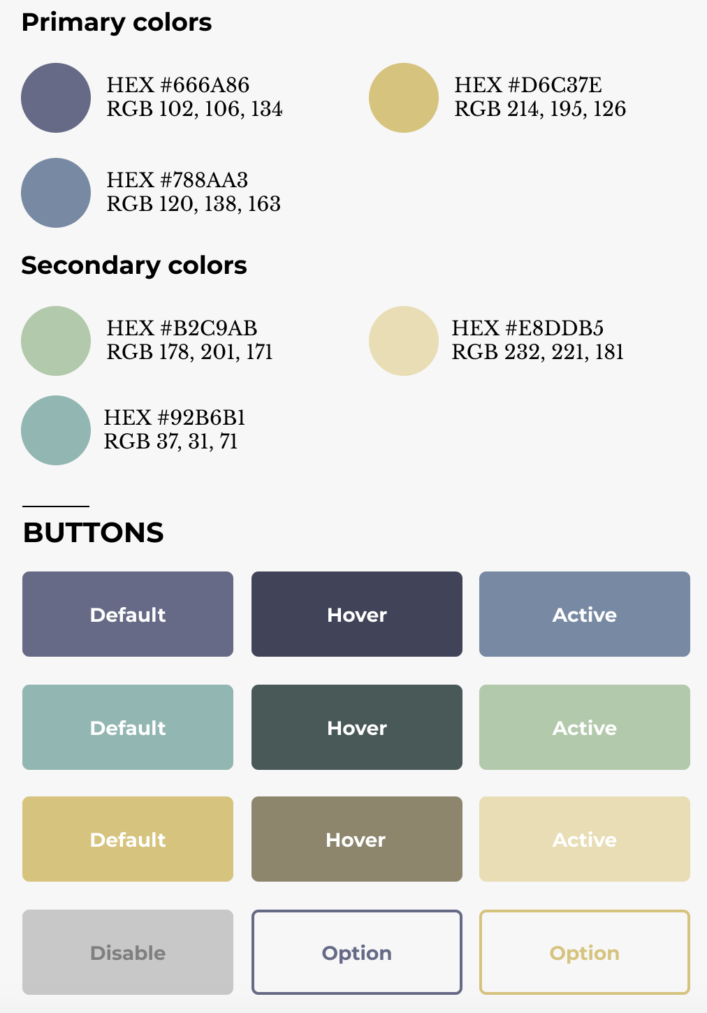
Color section of Style Guide
Another sharper color-yellow, which is used for drawing the user’s attention and driving them to click. This color is also applied to the content and buttons on the Account Upgrade section to differentiate it from other pages because that is a special part that we treat the potential valuable customer differently.
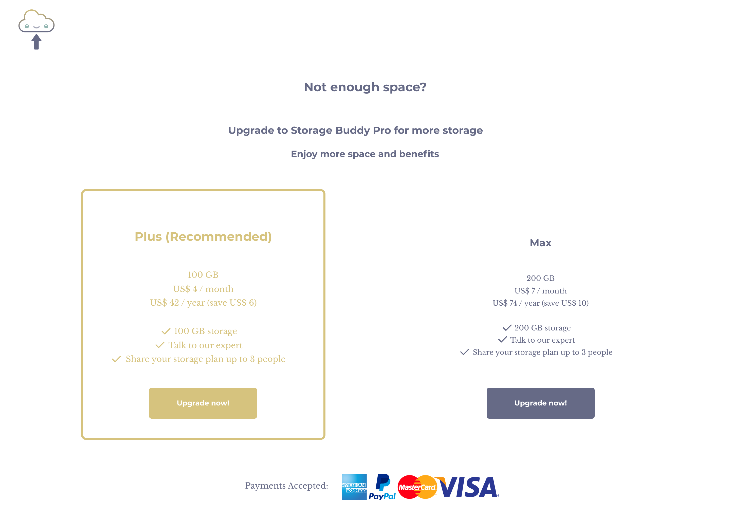
Account Upgrade page
For less important information or button such as ‘browse’ to upload a file, I would use green to support it, so that yellow still stands out among these colors.
II. TYPOGRAPHY
Using Montserrat typeface for headings is modern and clean as it provides enough spacing between each character, making it easy to read, especially most of the headings being used are single-lined.
Libre Baskerville was used for the body because serif type can direct the user’s reading. Again, the character spacing is not packed, resulting in comfortable reading.
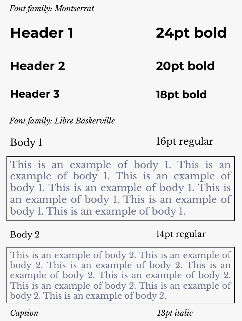
Typography section of Style Guide
- BRANDING -
Another result we learned from the survey is that users usually use the cloud storage app for work. Therefore, the feeling of the app should be neutral, especially in the cloud storage market. Beside ensuring the workflow to be as simple and efficient as possible, we hope to make the brand style a little bit casual and interesting to differentiate it from competitors.
BRAND CHARACTERISTICS
-Direct
-Young
-Soft
-Casual
-Connected
-Neutral, not
fancy
Moodboard
- LOGO DESIGN -
Below are the sketches for the logo design.
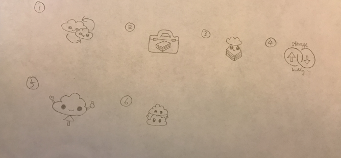
Logo Sketches
We thought that option no. 4 and 5 were the potential logos. For no. 4, it can represent the app by showing the brand name with the upload and download icons. However, the impression it gives is serious and boring, not matching to my brand character. In the end, we decided to pick no. 5 because it is simple, direct and more casual.
People understand something is uploaded to “the cloud”, but they also reflected that the hands were not necessary, hence the hands were taken away. Also, the brand colors were applied to the logo.
Digital Logo
PROTOTYPE AND TESTING
- PROTOTYPE -
During this process, there are many challenges encountered and lots of iterations involved. Here below we show three of them.
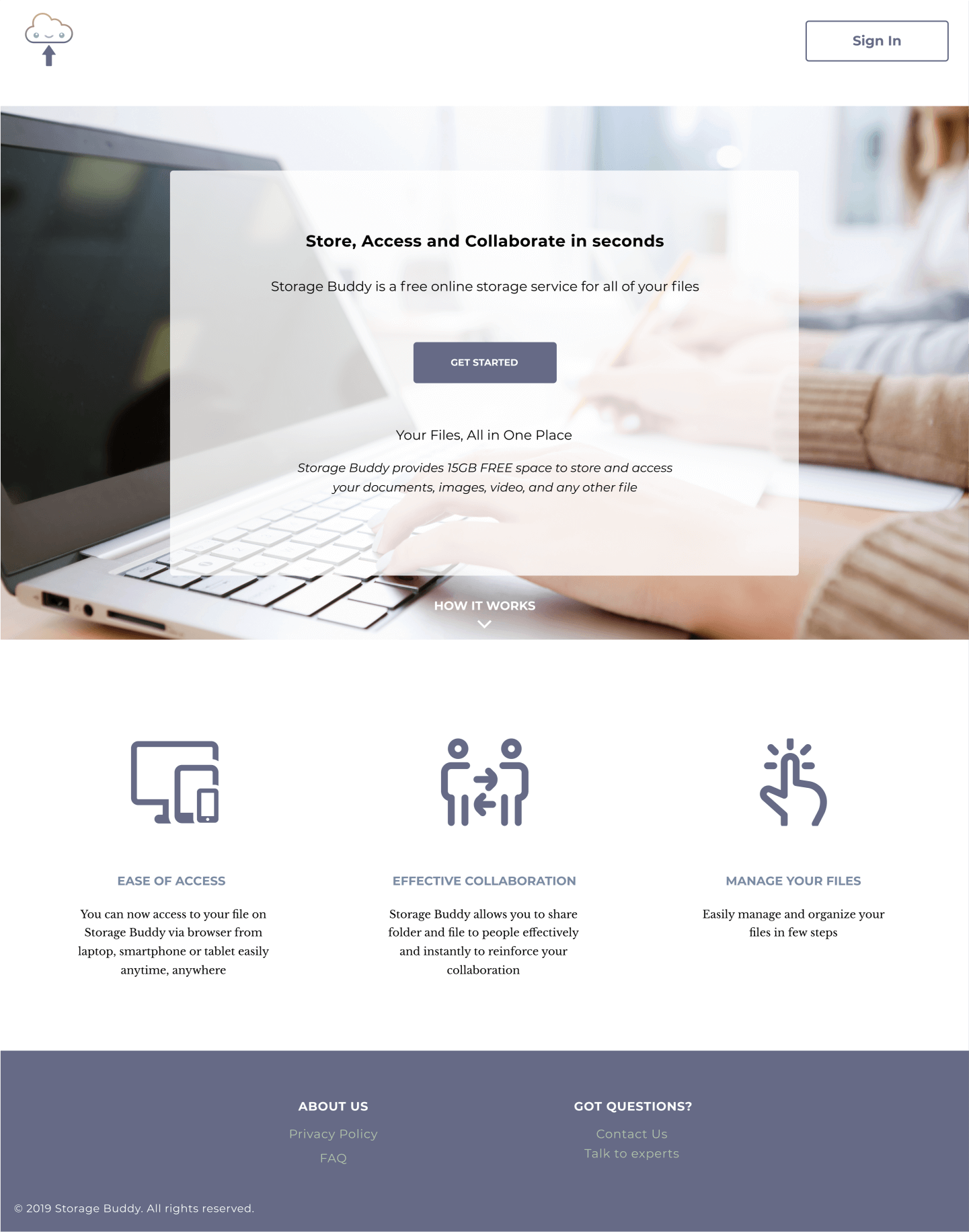
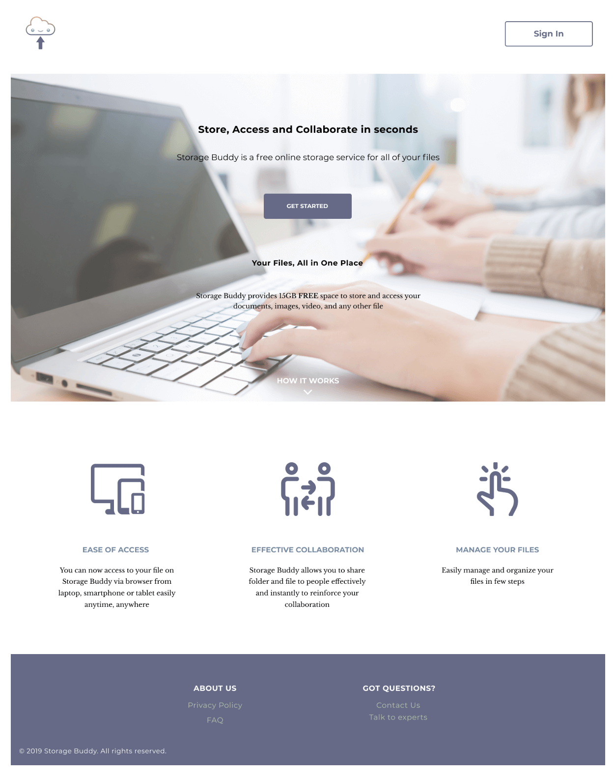
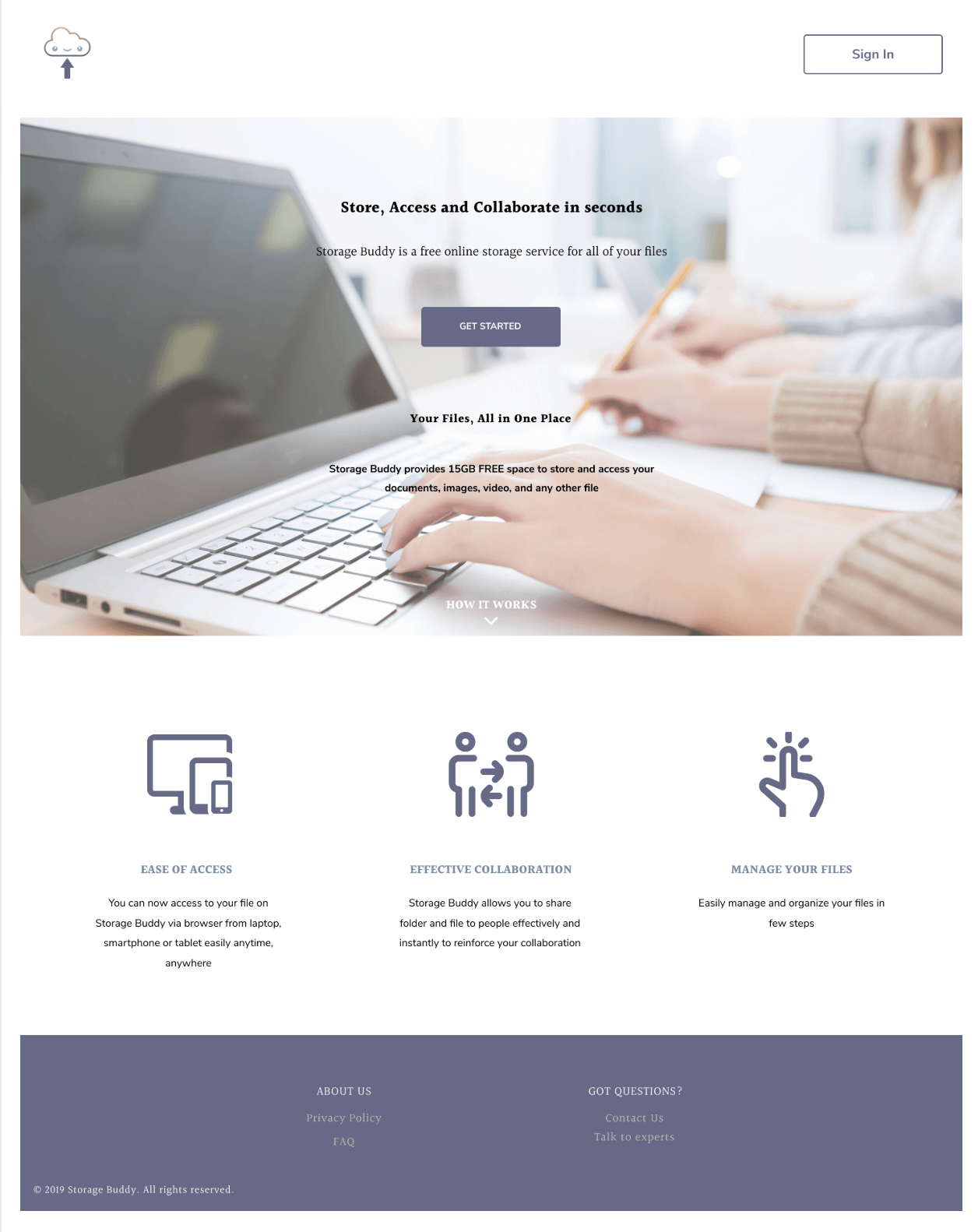
The landing page
I. DARK HERO IMAGE WITH BLACK WORDING
We tried a few hero img here but the problem was the wording was too hard to read on a dark background. So, I added a transparent white box between the layers of background and wording to make it more visible.
II. INCONSISTENT STYLE OF ICONS
Also, the icons I used in the middle of the page do not look unified. Therefore, I spent some time to look for some icons with a similar feeling, change their colors to my primary color and unify the thickness of the icon to solve it.
III. CONFUSING DESIGN OF BUTTON
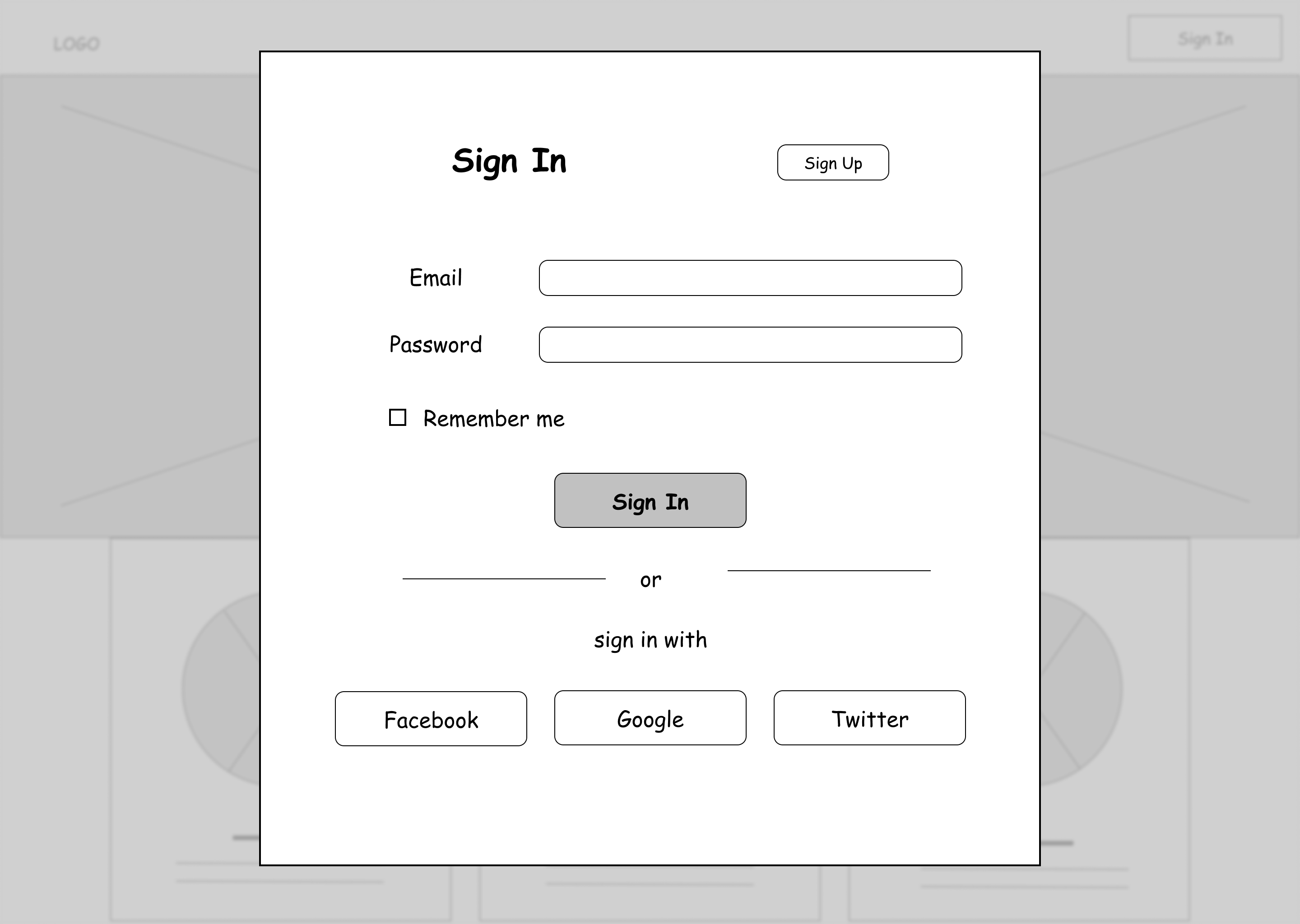
For the sign in page, the sign-up button should have a border surrounding it, referring to the digital wireframe. However, participants of the prototype test reflected that they got confused about the current page they were in. It did not look like an option which they can switch to the sign-up page, or vice versa. Therefore, we changed the sign-up button to a subtle look with an underline to hint the user. Also, using upper case for the current page on the header makes the user understand where they are at.
The wireframe of sign in page
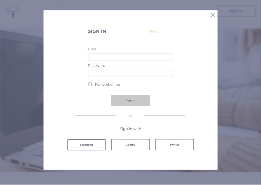
The mock-up of sign in page
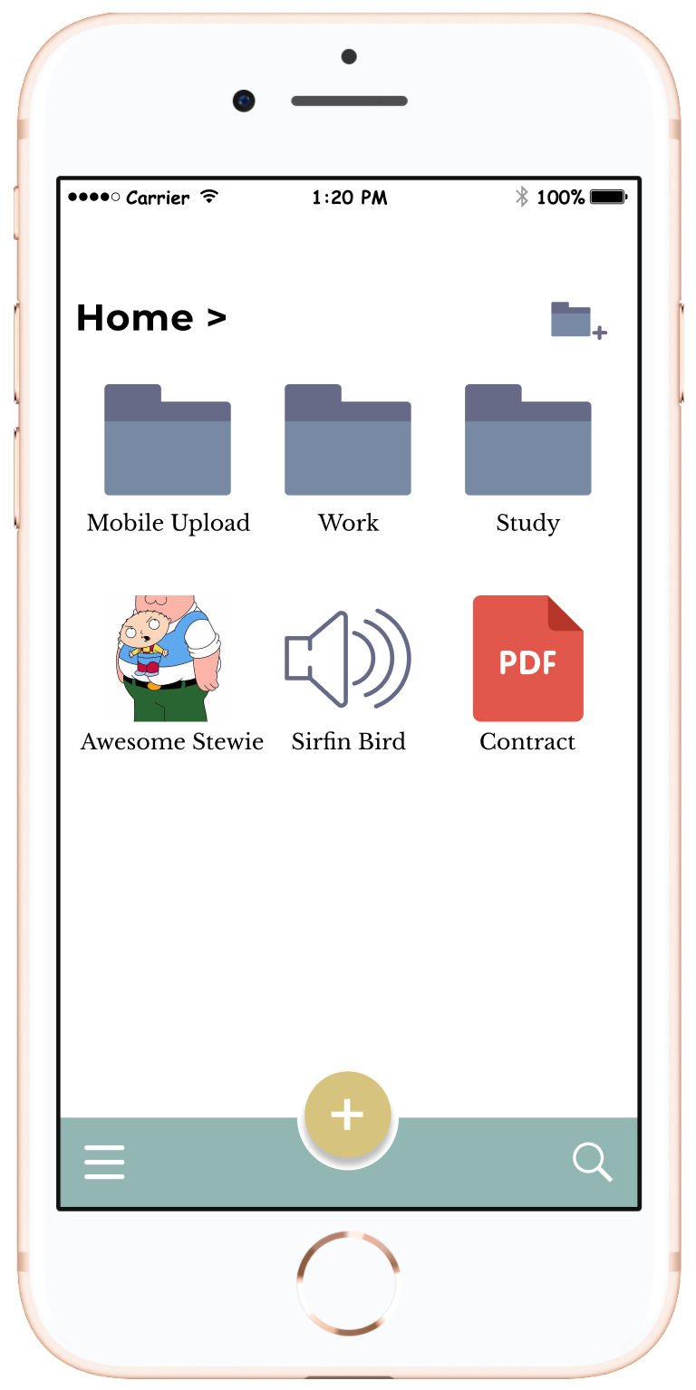
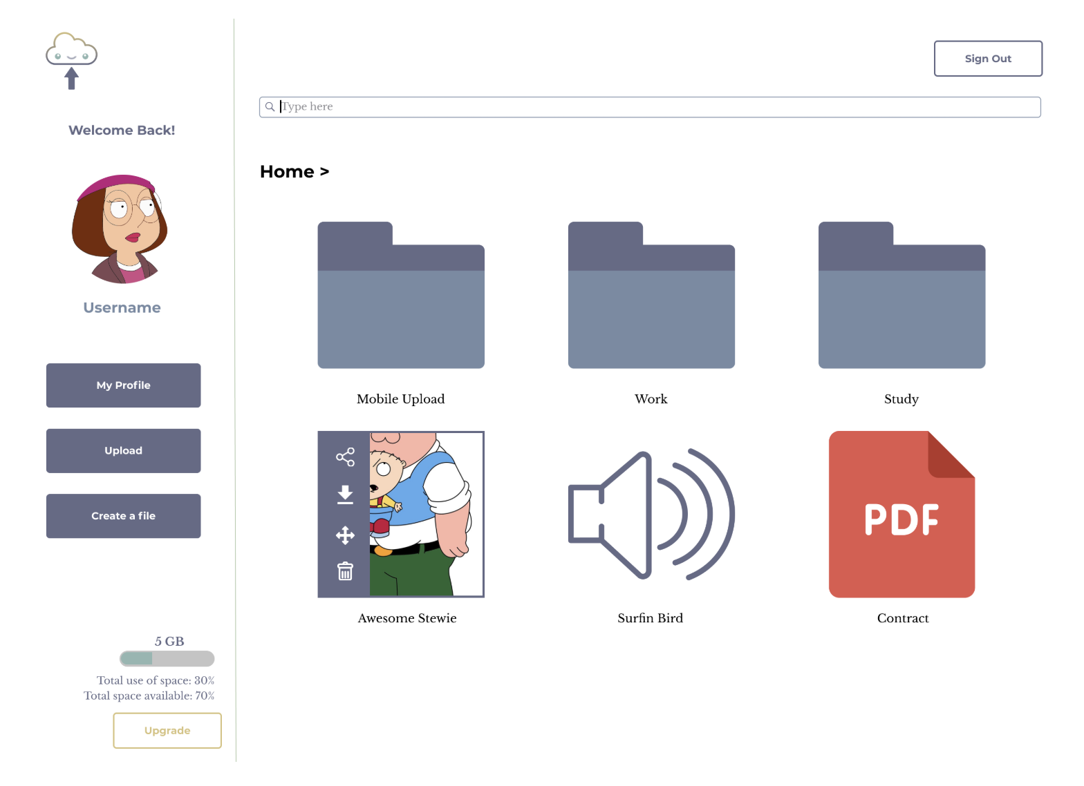
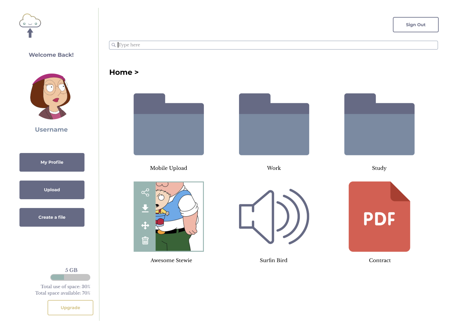
SELECT A FILE
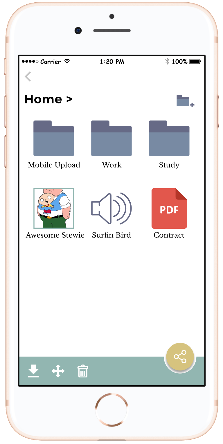
Action buttons pop up when the user clicks the file on the dashboard page. They can choose to share, download, move or delete. They can select more than one file at a time, or click the file again to cancel it.
Action bar pops up when the file is selected
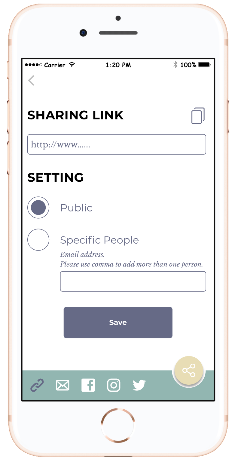
SHARING A FILE
On the sharing screen, by default, it jumps to the frequently-used sharing method-generating the sharing link because we wanted to reduce the steps of clicking as possible. If the user wanted to share it to email, Facebook, Instagram or Twitter, they could refer to the buttons at the top.
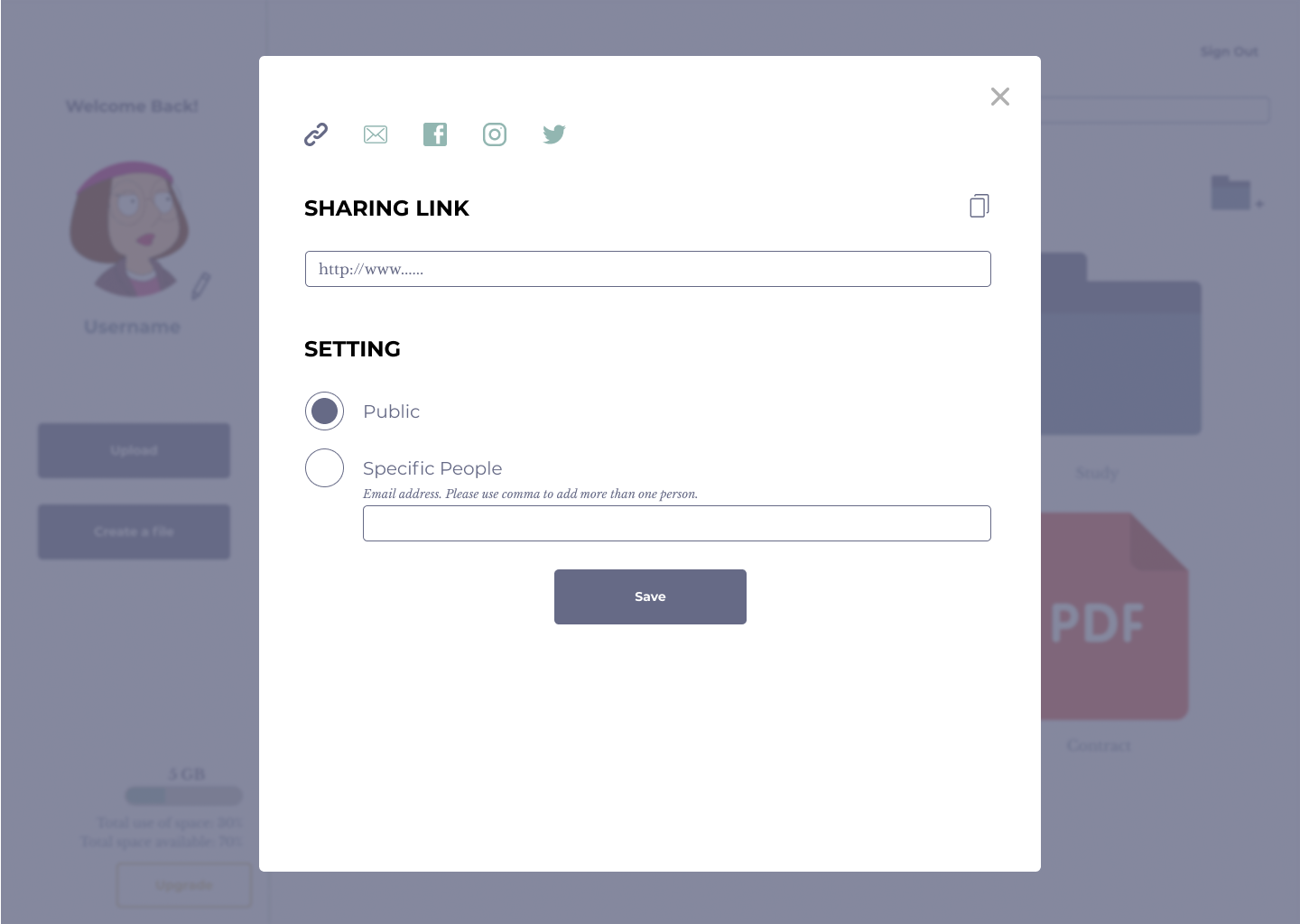
The sharing screen
UPLOAD A FILE
The file uploading process is simple. All buttons are disabled until the user drag and drop a file.
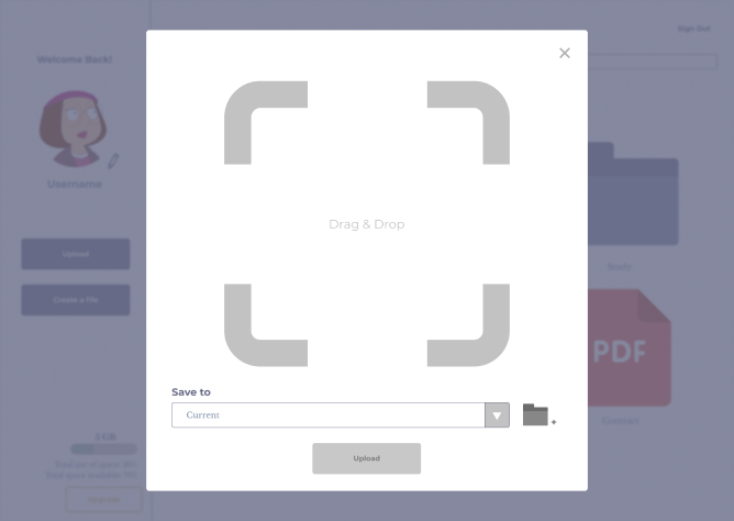
The buttons are disabled
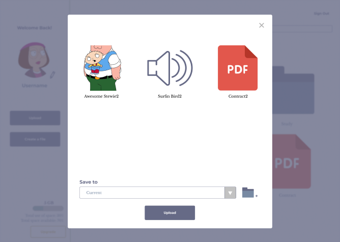
The color of the buttons changes to blue when activated
COLOR IN DIFFERENT STATUSES
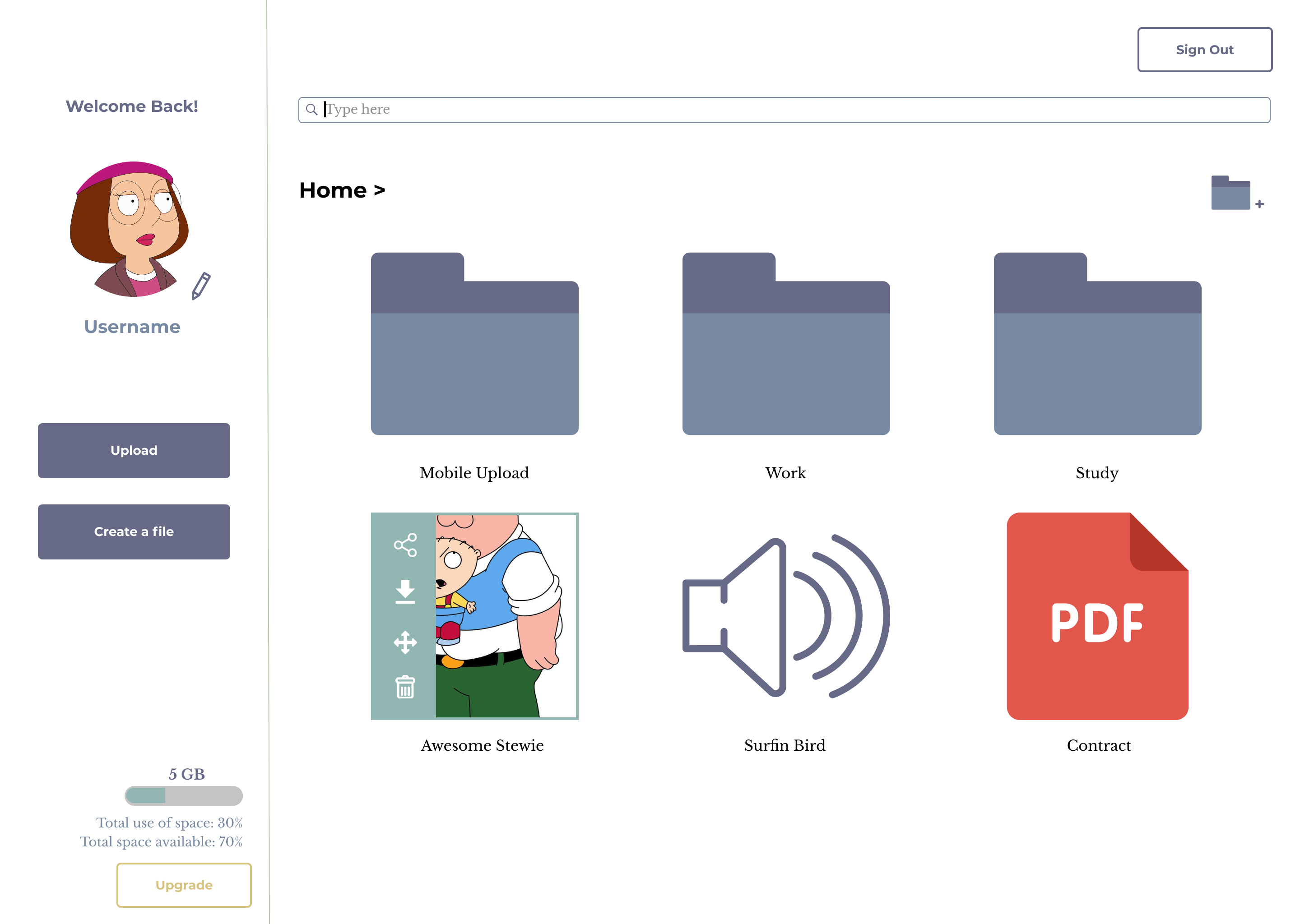
Not only color changes with the button status, but also applies to the field status. All the fields are locked, indicated with a gray background, until the user clicks “Edit” to update their account information.
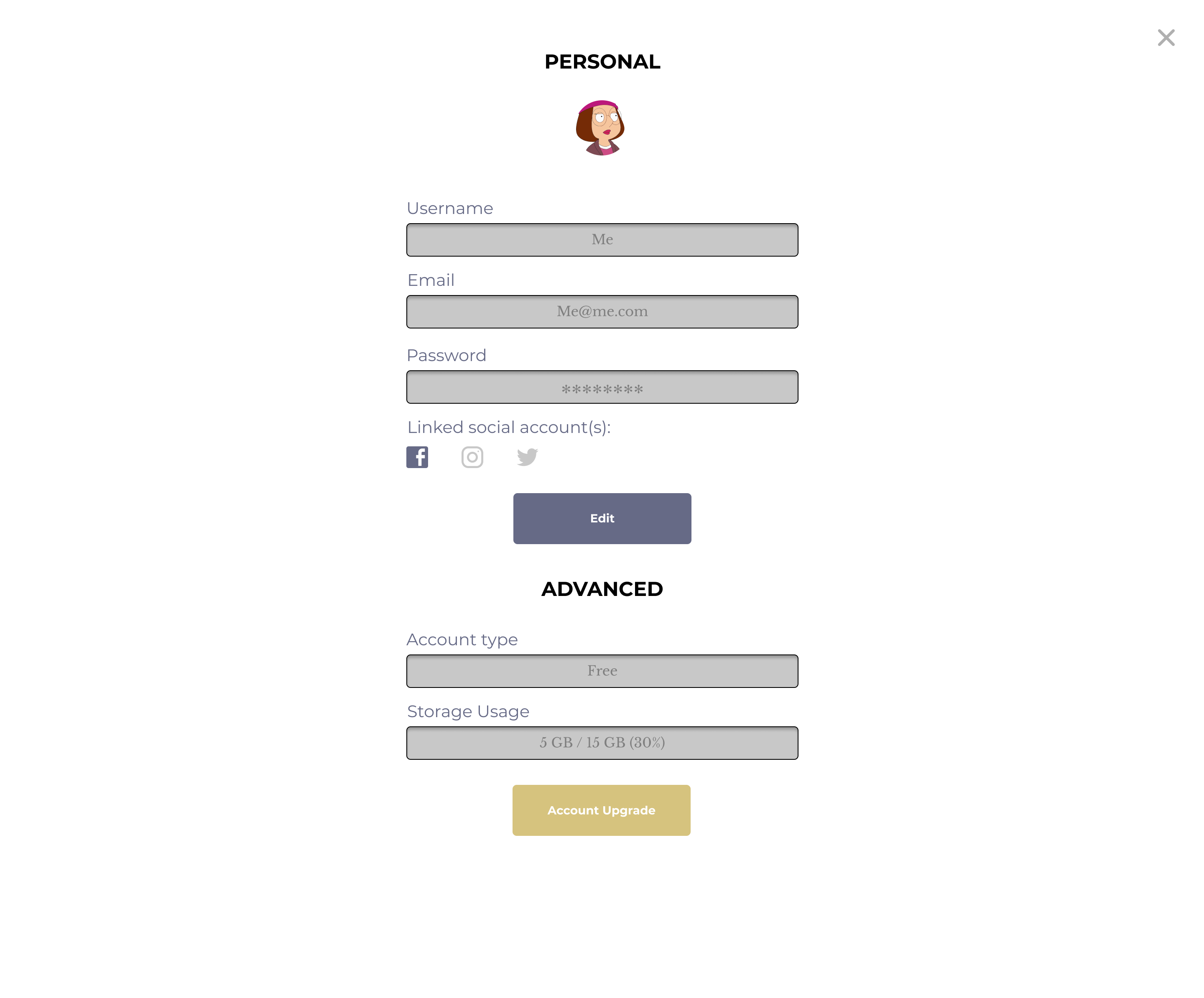
Users cannot edit the information until “Edit” button is clicked
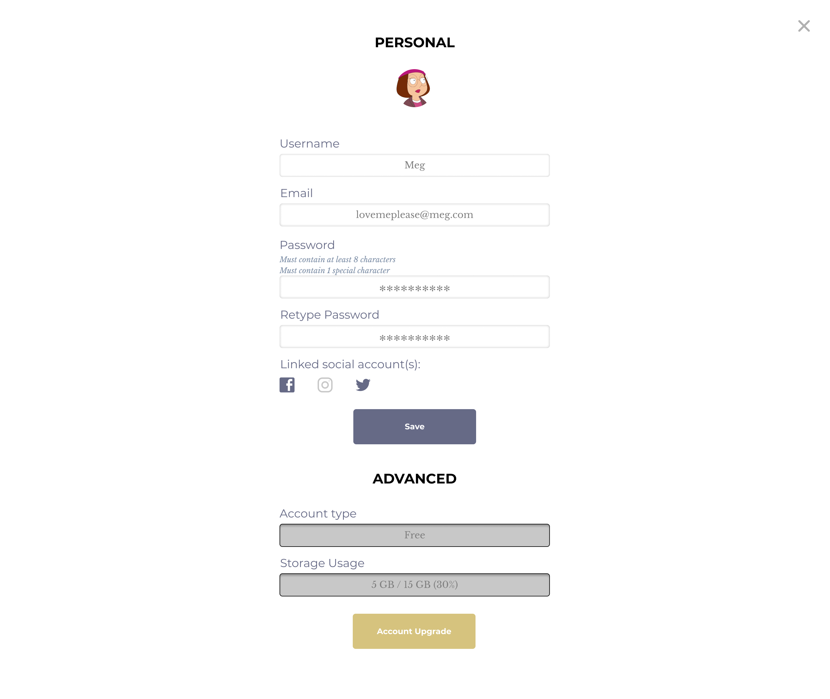
The color of fields changes, implying the input field is ready to type
Considered by the user behavior on mobile, color plays an important role here. From the survey, we learned that users upload files frequently, therefore we put the upload button at the bottom of the screen on the mobile version.
When the user select a file, there would appear a border around the file, then they can hit the “share” button at the bottom right.
If the user clicks “share”, the button turns into light yellow to respond to the user’s action and let them know they are on the sharing screen.
Select and share a file on mobile
- USABILITY AND PREFERENCE TESTS -
In the final round of usability test, we tested sign-in, sign-up, sign-out, upload, download, share, move, upgrade an account, update the profile.
The feedbacks are “CREATE A NEW FOLDER button is missing on the dashboard”, “MY PROFILE button is a bit outdated and not necessary” and “hope to create a sub-folder quickly while moving a file”.
Then, we added a “create a new folder” icon on the dashboard, so that this feature is not only limited while moving a file. Additionally, we created an optional form for the user to create a sub-folder at the same time while moving a file. On the other hand, we simplified the way of updating “my profile” by adding a pen icon next to the profile picture to allow the user to update it.
An optional form creating a sub-folder is created
PREFERENCE TEST I: TYPOGRAPHY
The difference of typography here is switching the font faces for the heading and body. Which one would you prefer?
It is using Montserrat for heading and Libre Baskerville for body.
It is using Libre Baskerville for heading and Montserrat for body.
100% of the participants went for the first one because the concern for the readability on a tablet, computer and mobile-the softer look would make it clearer to read. Also, they thought Montserrat looked modern and professional in a heading.
PREFERENCE TEST II: COLOR
Action bar in blue
Action bar in green
Although 88% of participants go for the one with a blue pop-up box due to consistency with the theme color, we took the comments from both sides and decided to use the green one.
We skipped placing all the buttons on the top right corner as before since test participants reflected that it was annoying to go back and forth to find those buttons especially when they already scrolled down to select the files. Therefore, the color contrast or difference plays an important role to hint the user that they have selected the file and show them that they can do some actions with it.
Original wireframe of the dashboard
Another point is that the first button of “select” is redundant. Users should be able to select the files by just clicking them. These are the takeaways from the first round of usability test. For these reasons, the action buttons will only pop up when the user selects the file(s).
PREFERENCE TEST III: LOGO
We modified the logo with 2 more options for the usability test. We thought providing the name would make it easier for the audience to understand what the app is by just looking at it.
Three logo options
However, the assumption was wrong. The result of the usability test is, people would prefer the first one. Respondents said that it was to the point, unique and adorable.
We decided to use the icon only without wording because the branding tends to be friendly and casual. The other one would look more serious comparing to the cloud icon itself.
CONCLUSION
SOLUTION
It solved the problems of overwhelming options during organizing the files for the user. The action buttons like download and share icons would only appear when the user selects a file, at the right time. They do not need to go back to the very top to click the action buttons.
Also, the steps of action were reduced, such as sharing, it directly goes to the sharing link to make it convenient for the user to copy it.
IMPROVEMENT?
The participants involved in the test did not know that they can multi-select the files at a time and unselect it by clicking on it again. A simple tutorial section could be added after the sign-up procedure in order to improve the user experience.
Another minor thing I can think of is, the look of thumbnail for the files can be unified, e.g. MP4, PDF, document and notes. So that the user can be able to know the file types instantly.
VIEW PROTOTYPE (DESKTOP) VIEW PROTOTYPE (MOBILE)VIEW OTHER CASE STUDIES...
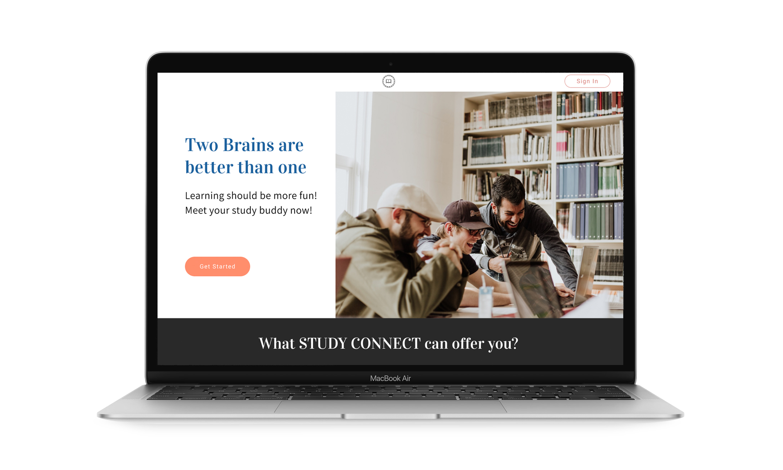
Study Connect
Study Connect is an app for study groups to plan their schdeules with peers and tutors
VIEW CASE STUDY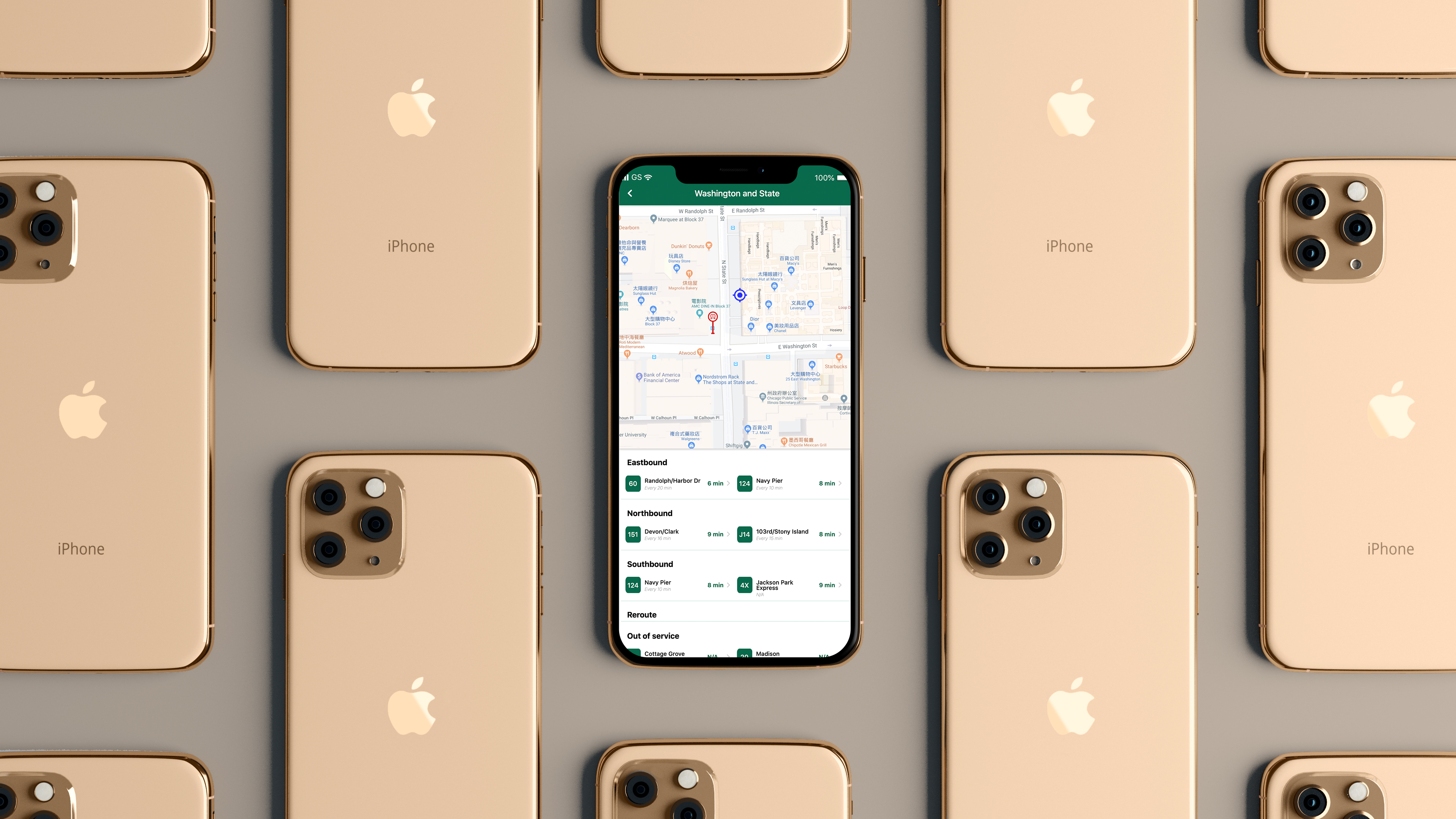
BusyBus
BusyBus is a public transit app, showing the next arriving bus to solve the problem of too many bus lines serving the same stop
VIEW CASE STUDY